What Colors Go With Cherry Wood? A Complete Pairing Guide (And Why It Changes)
The best colors to pair with cherry wood are warm neutrals like cream and soft gray-green, plus deep accent tones like navy blue and forest green – but the honest answer changes depending on how old the piece is. Cherry wood starts out light and pinkish when freshly cut or sanded, then darkens to a deep reddish-brown over the following months as it’s exposed to light and air. A color scheme picked for brand-new, pale cherry can look mismatched a year later once the wood has fully matured.
Below is how to choose colors that work now and still work once the wood settles into its final tone, plus which combinations to avoid and why.
Cherry Wood’s Color Isn’t Fixed – Plan Around How It Ages
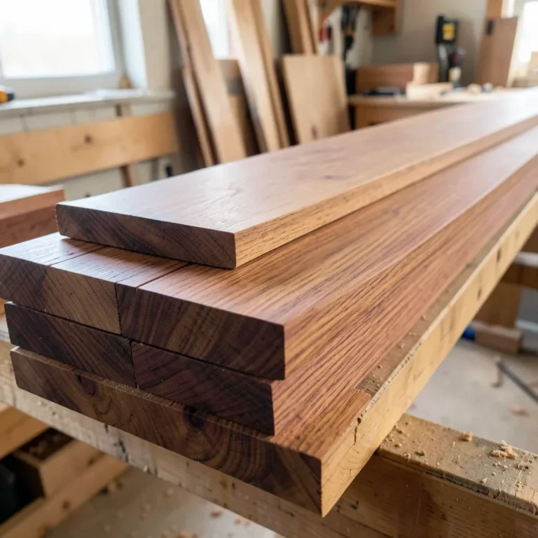
Most color-pairing advice treats cherry wood like a single fixed shade. It isn’t. Cherry contains natural compounds that react with UV light and ordinary room air, which is why a freshly milled cherry board looks pale, salmon-pink, almost blond – and the same piece looks a rich reddish-brown a year later. According to our own breakdown of the process in does cherry wood darken over time, roughly 80% of that color shift happens within the first six to twelve months, and it moves noticeably faster on pieces that sit near a window in direct sunlight than on ones kept in shade.
Best For Matching Cherry Tones
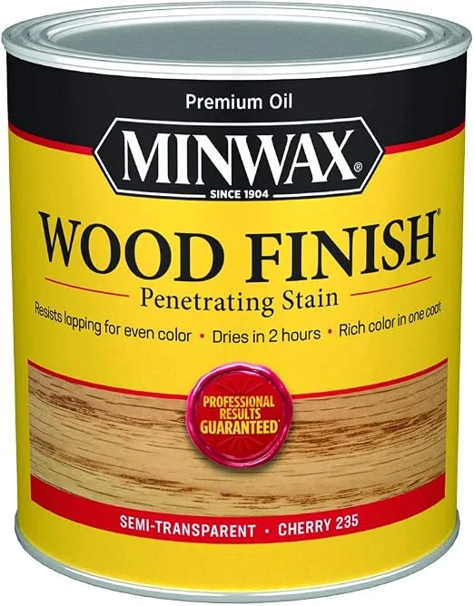 |
Minwax Wood Finish Oil-Based Stain, Cherry (1 Quart) – $13.88 If your cherry furniture has already darkened since you bought it, matching new pieces or touch-ups starts with a stain formulated for true cherry tone.
|
That timeline matters for color pairing for one practical reason: a wall or upholstery color chosen to match a brand-new, light cherry table can start to look slightly off once the wood ambers up. The fix isn’t complicated – lean toward colors that work across cherry’s whole range (pale pink-tan through deep red-brown) rather than colors that only flatter one end of it. Warm neutrals and deep jewel tones both do this; very light, cool colors are the ones that tend to fall out of sync as the wood darkens.
The other thing to get right is undertone. Cherry wood’s undertone is warm and reddish, not orange like oak or yellow like pine. Colors that share that warmth – or sit as a true complement to it on the color wheel – read as intentional. Colors with a cool, blue-gray undertone can fight it instead, which is the single most common mismatch we see in rooms built around cherry furniture or cherry wood floors.
Warm Neutrals: The Safest, Most Reliable Pairing
Warm neutrals are the closest thing to a guaranteed match for cherry wood, at any stage of its darkening. They don’t compete with the wood’s reddish undertone, and they still look right after the wood ages a shade or two darker.
- Cream and warm white – the most forgiving option for walls, trim, or upholstery. Avoid stark, blue-based whites; they push cherry’s red undertone into looking pink rather than rich.
- Soft gray-green (sage) – reads as neutral but has enough warmth to sit comfortably next to cherry’s red-brown tones, which is why it shows up so often in cherry kitchen and cabinetry photos.
- Warm taupe and greige – a middle ground between beige and gray that works well on larger surfaces like walls or an area rug, letting cherry furniture stay the focal point.
- Camel and warm tan – useful for leather or fabric upholstery near cherry pieces, since it echoes the wood’s warmth without matching it so closely that the two blend together.
If you’re working with cherry cabinetry specifically, warm neutrals on the surrounding walls and countertops give the cabinets room to be the visual anchor of the kitchen, which is usually the effect people are after when they invest in cherry in the first place.
Bold Accent Colors That Actually Work With Cherry
Cherry wood can carry more saturated color than most woods without looking busy, because its reddish undertone gives bold colors something to play off of instead of competing with. These are the accent colors that consistently work in real rooms, not just in theory:
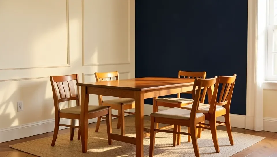
- Deep navy blue – a genuine complementary pairing. Navy sits opposite red-orange on the color wheel, so it makes cherry’s warm undertone look richer instead of clashing with it. Popular on accent walls and in upholstery behind cherry furniture.
- Forest and hunter green – another true complement to cherry’s warm red-brown, and a combination that’s become a standard pairing in interior design specifically because it holds up as the wood darkens.
- Olive green – a more muted, earthy option than forest green. Works especially well if the room already leans toward warm neutrals and you want a subtle accent rather than a strong contrast.
- Deep teal – has enough blue-green coolness to contrast cherry’s warmth, but its depth keeps it from reading as harsh the way a brighter, lighter teal can.
- Burnt orange and terracotta – an analogous pairing (colors that sit near each other on the wheel) rather than a complementary one. This amplifies cherry’s warmth instead of contrasting it, which makes a room feel cozier but less visually dynamic.
Colors to Be Careful With: Cool Grays and True Black
This is the part most cherry-wood color guides skip, and it’s worth saying plainly: not every neutral works. Cool, blue-based grays – the kind common in modern and Scandinavian-style interiors – can look jarring against cherry’s warm reddish tones instead of complementary. The mismatch is undertone, not value; a gray that reads as calm and neutral next to oak or walnut can read as cold and mismatched next to cherry because the two undertones (blue-gray vs. warm red) are fighting rather than balancing.
True black works in small doses – hardware, a lamp base, a picture frame – but a large black surface (an accent wall, a black sofa) next to cherry tends to make the wood look muddier rather than richer, especially once the wood has darkened past its first year. If you want dramatic contrast, a very deep navy or charcoal with a warm undertone gets you the same visual effect without the clash.
If you already have cool gray walls and cherry furniture and don’t want to repaint, the easiest fix is to introduce a warm neutral or one of the complementary accent colors above through rugs, textiles, or a single accent wall behind the cherry piece – you don’t have to redo the whole room to fix the undertone mismatch.
Cherry Wood Floors and Cabinetry: Matching Walls and Trim
Floors and cabinetry are a different situation than furniture, mainly because of scale – a cherry floor or a full run of cherry cabinets covers far more visual area than a single table or dresser, so the wall and trim colors around it have more work to do.
For cherry wood floors, a soft warm white or light greige on the walls keeps the room from feeling visually heavy, since the floor itself is already a strong warm color statement. Trim in a slightly warmer white than the walls (rather than a stark bright white) tends to look more intentional. For cherry cabinetry, keep countertops and backsplash in warm neutrals – a honed warm-gray or cream stone reads as coordinated, while a cool blue-gray quartz can make the cabinets look dated faster as they darken.
One detail worth noting for floors specifically: cherry flooring darkens unevenly if furniture, rugs, or cabinets block light from part of the floor for months at a time. Rearranging furniture or rugs periodically in the first year or two helps the color even out, rather than leaving a lighter “shadow” where something sat.
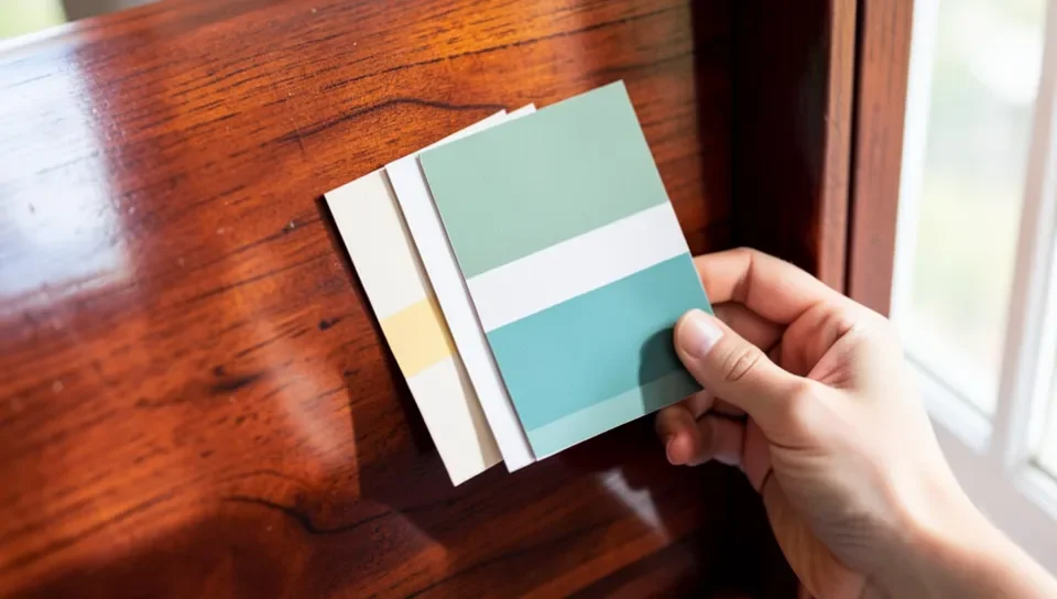
Using a Paint Color Chart to Match Cherry Tones
If you’re picking a wall paint to go with cherry wood, don’t try to match cherry’s color directly – matching a saturated wood tone with flat paint almost always looks like an attempt at matching furniture that missed slightly. Instead, use a paint color chart to find neutrals or complementary tones that sit a step or two away from cherry’s exact hue, using the categories above (warm neutral, or a true complement like navy or forest green) as your starting filter rather than browsing the whole chart.
It also helps to hold physical paint swatches up against the actual wood in the room’s real lighting before committing – the same swatch can look warmer under incandescent bulbs and cooler under daylight-balanced LEDs, and cherry’s reddish undertone will exaggerate that shift more than a neutral wood like oak would. If the cherry piece is newer, hold the swatch against it and picture it a shade or two darker and redder, since that’s the direction the wood is heading over the next several months. Our wood stain color chart guide is a useful reference if you’re also refinishing or touching up any wood surfaces alongside a paint update.
Frequently Asked Questions About Colors That Go With Cherry Wood
What color complements cherry wood the most?
Warm neutrals like cream and warm white complement cherry wood most reliably across its full color range, while deep navy blue and forest green are the strongest bold complements because they sit opposite cherry’s warm red-brown undertone on the color wheel.
What colors should you avoid pairing with cherry wood?
Cool, blue-based grays and large areas of true black tend to clash with cherry wood because their cool undertone fights cherry’s warm reddish undertone. Small black accents (hardware, frames) are fine; a full black wall or sofa next to cherry usually isn’t.
What wall color goes best with cherry wood floors?
A soft warm white or light greige works best with cherry wood floors. Because floors cover so much visual area, a warm neutral keeps the room balanced instead of competing with the wood’s strong color, while a cool-toned white can make the floor look mismatched.
Does cherry wood’s color change enough to affect color pairing?
Yes. Cherry wood typically starts pale pink-tan and darkens to a deep reddish-brown, with most of that shift happening in the first six to twelve months of light exposure. Colors chosen only to match new, pale cherry can look slightly off once the wood matures, so it’s safer to pick colors that work across its whole range.
Do olive and cherry wood actually go together?
Yes – olive green is a muted, earthy accent that pairs well with cherry wood, especially in rooms that already lean toward warm neutrals. It reads as a softer, more subtle option than a bolder complement like forest green or navy.
Conclusion
Warm neutrals are the safest starting point with cherry wood, and navy blue or forest green are the most reliable bold accents, because both hold up as the wood darkens over its first year. The colors to be careful with are cool, blue-based grays and large black surfaces – not because they’re bad colors, but because their undertone fights cherry’s natural warmth. Whatever you choose, plan for cherry to end up a shade or two darker and redder than it looks on day one, and pick colors that still work once it gets there.
Sponsored / affiliate links. As an Amazon Associate I earn from qualifying purchases. I may earn additional commission from eligible campaigns.