What Colors Go With Cherry Wood Bedroom Furniture?
Cherry wood’s warm red-brown undertone pairs best with true neutrals like cream and warm gray, plus complementary cool tones such as sage green or navy blue — but stark white or cool blue-gray fights that warmth and can make the wood look orange. Getting the undertone wrong is the number one reason a “matching” color scheme falls flat. This guide covers 14 tested color combinations, the color-theory reason cherry needs warm-toned neutrals, and which shades to avoid.
Why Undertone Matters More Than the Color Itself
Best Cherry Wood Care Pick
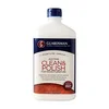
Guardsman Clean & Polish for Wood Furniture – $7.99
Guards against water marks, drying, cracking, and UV discoloration — the exact fading this guide covers — while cleaning dust that dulls cherry’s natural warmth.
- Best for: pieces that sit near a sunny window
- Why we picked it: named UV protection matches the fading issue this article warns about
- Main drawback: cream formula needs a soft cloth, not a spray-and-forget routine
Compare more wood care options
 Option 1 Howard Feed-N-Wax Wood Polish, 16oz – $11.48
|
 Option 2 Howard Feed-N-Wax Wood Polish, 8oz – $9.47
|
 Option 3 Old English Lemon Oil, 16oz – $5.98
|
As an Amazon Associate we earn from qualifying purchases.
Cherry wood is a hardwood cut from the black cherry tree (Prunus serotina) with a naturally warm, red-to-orange undertone that deepens the longer it’s exposed to light. That undertone — not the color itself — is why some technically “good” colors still clash: a cool-toned gray or an icy blue fights the wood’s warmth instead of complementing it, even though gray and blue both work when they lean warm.
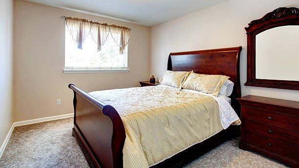
The fix is simple color-wheel logic. Warm reds and oranges look best next to true, warm-leaning neutrals (cream, greige, warm gray) or their direct complements on the color wheel — green and blue. Cool, blue-based neutrals sit on the wrong side of that wheel, which is why a “safe” light gray can still look off against a cherry wood sleigh bed or dresser.
📊 About 80% of cherry wood’s total color change happens in the first 6–12 months as UV light and natural oxidation deepen it from pinkish-brown toward a richer reddish-brown — no clear finish stops it. See the full timeline in our cherry wood darkening breakdown. — Source: Thos. Moser, Cherry’s Beauty Over Time
“The wall color almost never causes the clash people blame it for — a ‘cool’ gray fighting the wood’s warm undertone does. Once we started picking warm-based neutrals first, complaints about cherry furniture looking dated basically stopped.”
How to Keep Cherry Wood’s True Color From Fading
Because cherry keeps darkening and reddening for months after you buy it, the color scheme you pick on day one can look slightly different a year later — especially on pieces that sit near a sunny window. Direct UV exposure speeds this up, and everyday dusting with the wrong product can also dull the finish and gray out the wood’s natural warmth over time.
A polish or conditioner made for wood furniture (not a generic all-purpose spray) slows visible fading and keeps the finish from clouding, so the warm tone you designed your room around stays accurate longer. Look for one with UV-blocking claims if the piece gets direct sun.
14 Colors That Go With Cherry Wood Bedroom Furniture
Every option below is grouped by why it works — true neutral, warm complement, or cool contrast — so you can pick based on the mood you want, not just the swatch.
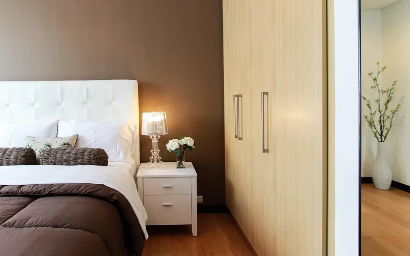
- Warm cream or ivory: the safest match — a soft warm-white that never fights cherry’s undertone.
- Greige (warm gray-beige): blends a neutral gray with enough warmth to sit comfortably next to red-brown wood.
- Soft dove gray, warm-based only: check the paint’s undertone card — a blue-based dove gray will clash, a warm-based one won’t.
- Sage green: cherry’s direct color-wheel complement; brings out the wood’s red tones without competing.
- Deep navy blue: a bold, cozy contrast that reads as intentional rather than clashing because blue sits opposite orange on the wheel.
- Muted teal: a cooler alternative to sage that still respects the complementary-color logic.
- Terracotta: an analogous warm tone — leans into cherry’s own undertone for a monochromatic-warm look.
- Mustard or golden yellow: a vibrant warm accent best used in bedding or a rug rather than every wall.
- Charcoal: a modern, high-contrast accent color — use on one wall or in textiles, not the whole room.
- Dusty blush pink: a soft, warm-leaning pastel that pairs surprisingly well with reddish-brown wood tones.
- Black: works only as a sharp accent (frames, hardware, lamp bases) — a full black wall overwhelms cherry’s warmth.
- Alabaster or warm white: a slightly warmer alternative to stark white for trim and ceilings.
- Olive green: an earthier cousin of sage that suits traditional or rustic bedroom styles.
- Brass or gold metallics: not a wall color, but hardware and lighting in warm metallics echo cherry’s own warm cast.
Colors to Avoid With Cherry Wood
These are the shades that most often get blamed as “cherry wood doesn’t match anything” when the real problem is undertone temperature, not the color family itself.
- Cool ash or blue-based gray — the most common mismatch; reads as flat or muddy next to red-brown wood.
- Stark, cool-toned white — can make cherry look orange by contrast instead of rich.
- Icy or pastel blue — too cool without enough saturation to act as a true complement.
- Lavender or lilac — a cool-leaning purple that competes with, rather than complements, cherry’s warmth.
- Bright orange — too close to the wood’s own undertone; competes instead of contrasting.
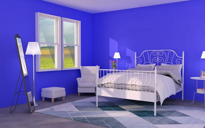
Best vs. Worst Wall Colors for Cherry Wood, by Room Style
| Room Style | Recommended | Avoid |
|---|---|---|
| Traditional | Deep navy, olive green, terracotta | Icy blue, lavender |
| Modern / minimalist | Greige, charcoal accent, alabaster | Cool ash gray, stark white |
| Farmhouse | Warm cream, sage green, mustard accents | Bright orange, neon accents |
Textiles, Bedding & Accent Pieces
Earth tones like beige and olive in rugs and curtains keep the room warm without adding another wall color to coordinate. Bedding in light gray or taupe reads elegant; soft pastels like blush or lavender-adjacent pink add calm without clashing, as long as they lean warm rather than icy.
Metallic accents in gold or brass — lamp bases, picture frames, drawer pulls — echo cherry’s own warm cast, while black or white accessories (a rug, a pillow, a frame) add sharp contrast without overwhelming the room the way a full black or white wall would. When choosing art, pieces with soft blues, greens, or warm peach tones tend to sit best above a cherry wood headboard or dresser.
Lighting Considerations
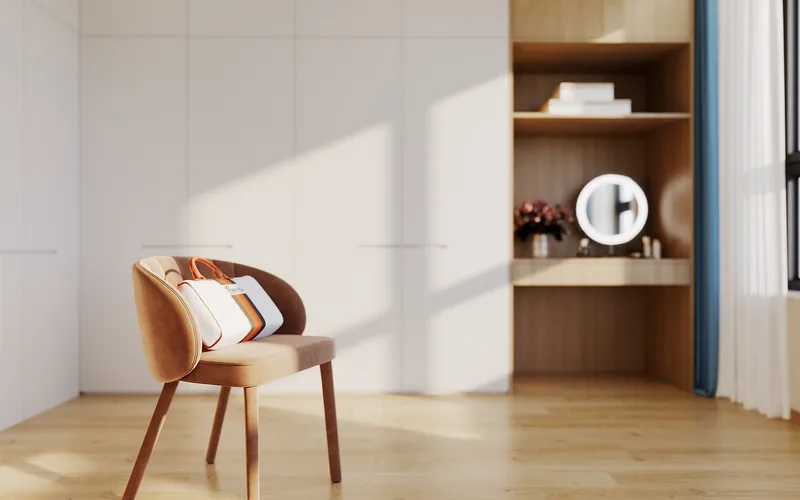
Light temperature changes how any of the 14 colors above actually read in the room. Warm (2700K–3000K) bulbs bring out cherry’s rich red-brown tones and make cool colors look muddier than they will in daylight; cooler bulbs (4000K+) can wash out cherry’s warmth and make it look flatter. If a room gets strong direct sun, remember the earlier point — that UV exposure is also what’s actively darkening the wood itself, not just lighting the room.
Frequently Asked Questions
What Paint Color Goes Best With Cherry Wood Furniture?
Neutral tones like beige, cream, or warm-based light gray complement cherry wood furniture best. Soft sage green or navy blue offer a fresh, complementary contrast. Rich colors like deep teal or warm gold can enhance the wood’s warm tones. Test a sample on the wall before committing — undertone matters more than the color name.
Is Cherrywood Furniture Outdated?
No. Cherrywood furniture is not outdated — its durability and rich color keep it in regular use, and modern paint colors (sage green, charcoal accents, greige) update the look without replacing the furniture. Many homeowners specifically seek it out for its classic, timeless grain.
What Color Bedspread Goes With Cherry Wood Furniture?
Neutral colors like beige, ivory, or warm gray complement cherry wood furniture beautifully. Rich tones like navy or emerald green also enhance its warm hue. Patterns with subtle reds or browns tie the bedspread back to the wood itself. Velvet reads more formal; cotton or linen reads more casual.
Do Gray And Cherry Wood Go Together?
Yes, but only warm-based gray. A gray with warm undertones provides a neutral backdrop that highlights cherry’s rich hues, working in both modern and traditional bedrooms. A cool, blue-based gray does the opposite — it fights the wood’s warmth and is the single most common mismatch on this list.
What Undertone Is Cherry Wood?
Cherry wood carries a warm red-to-orange undertone from natural phenolic compounds in the grain, and that undertone deepens toward reddish-brown the longer the wood is exposed to light. Because of this, colors need to be warm-toned or a true complementary cool tone like sage green or navy — pure cool grays or icy blues fight the undertone and read as mismatched.
Does Cherry Wood Furniture Change Color Over Time?
Yes. Black cherry darkens from a light pinkish-brown to a deeper reddish-brown through UV exposure and natural oxidation, with about 80% of the total color shift happening in the first 6 to 12 months. No clear finish stops this, so a color scheme picked on day one may look slightly different — and even better — a year later.
Conclusion
Cherry wood’s warm red-brown undertone is the real deciding factor — not the color name on the swatch. Stick to true neutrals (cream, greige, warm gray) or direct complements (sage green, navy blue) from the 14 options above, skip cool grays and stark whites, and expect the wood itself to keep deepening for the first year regardless of what’s on the walls.
Sponsored / affiliate links. As an Amazon Associate I earn from qualifying purchases. I may earn additional commission from eligible campaigns.