Wood Tone Pairing Chart: Matching Floors, Trim and Furniture
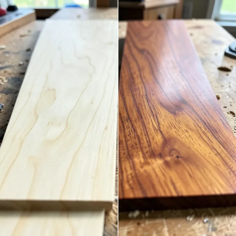
Pair wood tones by matching undertones first, then limit the room to a few wood finishes: one main tone for the floors, one supporting tone for larger furniture, and an optional accent tone for trim or small pieces. That simple filter holds up in real homes because wood color shifts with species, stain, finish, and light; the safest way to judge it is side-by-side in the actual room, not by stain name alone (USDA Forest Products Laboratory, Wood Handbook; Benjamin Moore color guidance; Sherwin-Williams color guidance). This guide maps floor, trim, and furniture pairings by undertone, contrast level, paint color, light, and room-to-room flow.
I’m writing this from the practical side, not the showroom side. When renovating older houses with honey oak, red-brown trim, gray-stained floors, and open-plan additions, the rooms that work best are not the ones with the “perfect” species name. They are the ones where the undertones agree, the value contrast is clear, and samples are tested in daylight and at night before buying anything large.
How to use a wood tone pairing chart in a real room
Start with the dominant surface, not the wood species
Species names help less than most shoppers think. Oak can read yellow, beige, gray, or brown depending on stain and finish. Walnut can read deep brown, purple-brown, or almost black. For room decisions, start with the wood surface you see most, because large surfaces control the color impression of the room more than smaller pieces do. In most homes, that is the floor. In a library with wall-to-wall built-ins, it may be the cabinetry. In a room with strong stained window trim, the trim can take over.
That is also how I approach real selections: I identify the least movable, most visible wood first. Floors, built-ins, and extensive trim are expensive to change. Coffee tables are not. Starting with the dominant surface keeps you from trying to “match” five smaller items to each other while ignoring the thing that actually sets the room.
Read undertone first, then value and grain
Undertone is the color cast sitting under the main wood color. Warm wood often has yellow, orange, red, or golden undertones. Cool wood may look gray, ash, or slightly washed out. Neutral woods sit between those poles and usually flex more easily across paint colors and furniture finishes. Color companies consistently advise judging undertone next to white and gray references because surrounding colors can exaggerate warmth or coolness (Benjamin Moore; Sherwin-Williams).
After undertone, read value. Light floors carry less visual weight than dark floors, so they leave more room for furniture contrast. Grain comes last. Busy cathedral grain on the floor can fight with equally busy furniture, even when the undertones align.
Use the room hierarchy rule before choosing accent woods
Set the hierarchy in this order unless the room clearly argues otherwise: floor, then trim, then furniture accents. Furniture is usually the secondary surface, especially tables, chairs, media consoles, bed frames, and built-ins. Once those larger pieces are settled, small woods such as frames, stools, and side tables can echo either the floor or the main furniture finish.
This stops the most common mistake: treating every wood item as equal. Rooms feel calmer when one wood leads, one supports, and one lightly repeats or contrasts. The National Wood Flooring Association’s guidance on evaluating floor color and finish in the room supports this bigger-picture approach; floors are the broad field against which the rest of the finishes are read.
How do I tell if a wood tone is warm, cool, or neutral?
Check the sample against plain white paper, then against a true gray item, in daylight and again at night. If the wood flashes yellow, orange, red, or gold, it is warm. If it turns ashy, gray, or slightly blue, it is cool. If neither cast dominates, it reads neutral.
The fast undertone test for yellow, orange, red, and gray casts
Lay the floor sample flat on the floor. Stand the trim or furniture sample upright beside it. That position change matters because floors pick up bounced wall color, while vertical pieces catch more direct light. If a wood looks tan alone but orange next to bright white paper, treat it as warm-orange. If it looks brown alone but mauve beside beige paint, that red cast will show in the room.
Gray-stained woods deserve extra care. Many look cool-gray on the face but warmer in the grain or at the edges. That mixed reading is why they can look fine in a store and wrong at home.
Why stain names mislead more than they help
Names like “driftwood,” “natural,” “provincial,” or “smoked” do not tell the full story. Two samples with the same stain name can land in different undertone families once finish sheen and wood species shift the result. Read the actual cast, not the label.
That applies to veneers and engineered flooring too. Engineered construction can change stability and installation method, but it does not erase color variation at the surface. You still need the same undertone check in the room.
How lighting changes what you think you see
Light changes the sample more than most people expect. Check wood in east light, afternoon sun, and with the lamps actually used, because the same board can swing from clean beige to peach or muddy taupe over a single day. A floor that looks neutral earlier in the day can shift warmer near sunset, and a gray stain may take on a muted brown or greenish cast under warm bulbs.
That is consistent with mainstream paint guidance: color temperature of natural and artificial light changes how warm and cool undertones present, which is why paint brands tell homeowners to sample in multiple lighting conditions before choosing a color. The same rule applies to wood right beside that paint.
Which surface should lead: floor, trim, or furniture?
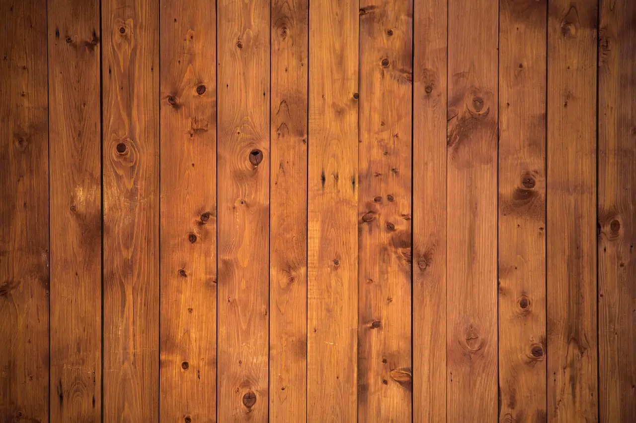
Flooring should lead in most rooms because it covers the biggest visual field under everything else and sets the base value for the space. Trim leads when stained wood wraps doors and windows throughout the room. Furniture leads when a built-in wall, large dining set, or bank of cabinets dominates more strongly than the floor or trim.
Why flooring usually sets the hierarchy
Floors carry both color and value across the whole room. Light floors recede. Dark floors advance and feel heavier. That visual weight affects everything above them, from bright white trim to a walnut dining table. In practice, once the floor is in, it becomes the reference point for every other wood sample you bring into the room.
On a recent living-and-dining project with pale white oak flooring, the original plan was medium oak furniture throughout. In person, it all sat too close in value and looked accidental. Swapping the dining table to walnut solved the room in ten minutes. The floor stayed the lead; the furniture finally read as a choice.
When painted or wood trim should take control instead
Painted trim can reset a room. Warm white and bright white both work, but not in the same way. Warm white usually sits more comfortably with yellow, honey, and soft brown floors. Bright white gives sharper edge definition around windows and doors, especially beside dark or strongly colored woods. Paint manufacturers make the same distinction when they talk about warm versus cool whites and their effect on nearby finishes.
Stained trim should lead if there is a lot of it and it is permanent. Orange-toned trim around every opening can overpower a neutral floor. In that case, furniture should step back and either go lighter, darker, or distinctly more neutral.
When a large furniture piece or built-in becomes the lead wood
Built-in bookcases, a wall of kitchen cabinetry visible from the living area, or a large dining set in an open-plan room can outrank the floor. Once a furniture mass gets that big, treat it like architecture. Pair the floor to it by undertone family and by clear value separation so the two surfaces do not blend into a flat blur.
I see this most often in open kitchen-family rooms. If the island, perimeter cabinets, and dining table all read as one giant wood block, the room gets heavy fast. If one of those elements leads and the others either simplify or contrast, the room breathes.
Wood tone pairing chart: 12 undertone combinations that work and clash
How to read the chart
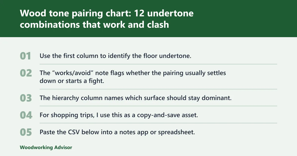
Use the first column to identify the floor undertone, then find the trim and furniture combination closest to the room. The “works/avoid” note flags whether the pairing usually settles down or starts a fight. The hierarchy column names which surface should stay dominant.
For shopping trips, use this as a copy-and-save asset. Paste the CSV below into a notes app or spreadsheet, save it as wood-tone-pairing-chart.csv, and keep it on your phone alongside your floor and paint photos. It is a practical companion to this wood tone pairing chart.
Scenario,Floor undertone,Trim,Furniture,Works/avoid,Room hierarchy
1,Neutral-beige light white oak matte,Warm white paint,Dark walnut oil-rubbed,Works; clear light-dark separation and calm undertones,Floor leads furniture contrasts
2,Neutral-beige light white oak matte,Bright white paint,Medium neutral oak or rift oak satin,Works if furniture is clearly darker than floor,Floor leads trim frames
3,Warm-yellow oak satin,Warm white paint,Soft brown walnut or medium brown ash,Works; warm family with enough value spread,Floor leads furniture supports
4,Warm-orange red oak satin,Bright white paint,Neutral brown oak or dark walnut,Works; trim cools the edge and dark furniture steadies it,Floor leads trim defines edges
5,Warm-orange red oak satin,Wood trim with orange cast,Red cherry furniture gloss,Avoid; orange plus red reads heavy and dated,Too many warm leaders fighting
6,Warm red-brown floor satin,Cream or warm white paint,Neutral brown or near-black brown furniture,Works; furniture moves darker or calmer,Floor leads furniture grounds
7,Cool gray-stained oak matte,Bright white paint,Blackened oak walnut or upholstery-heavy pieces,Works; keep wood count low,Floor leads trim sharpens
8,Cool gray-stained oak matte,Warm beige wood trim,Honey wood furniture,Avoid; cool floor and warm trim split the room,Trim and floor clash for control
9,Dark espresso or near-black floor low-sheen,Bright white paint,Light oak or unfinished-look white oak,Works; strong base with lighter furniture relief,Floor leads furniture lifts
10,Dark walnut-brown floor satin,Warm white paint,Walnut and leather-heavy mid-century pieces,Works if walls stay quiet and accents are limited,Floor and major furniture share lead
11,Medium neutral-brown floor satin,Painted trim,Furniture in nearly same value but cooler gray-brown,Avoid; similar depth mixed undertones muddy the room,No clear leader
12,Open-plan mixed flooring view,Consistent white trim,Repeat one anchor wood across rooms,Works; one repeated finish keeps flow,Shared anchor leads connected spaces
| Scenario | Floor undertone | Trim | Furniture | Works/avoid | Room hierarchy |
|---|---|---|---|---|---|
| 1 | Neutral-beige light white oak, matte waterborne finish | Warm white paint | Dark walnut, oil-rubbed or satin | Works; clear light-dark separation, calm undertones | Floor leads, furniture contrasts |
| 2 | Neutral-beige light white oak, matte | Bright white paint | Medium neutral oak or rift oak, satin | Works if furniture is clearly darker than floor | Floor leads, trim frames |
| 3 | Warm-yellow oak or honey oak, satin | Warm white paint | Soft brown walnut or medium brown ash | Works; warm family with enough value spread | Floor leads, furniture supports |
| 4 | Warm-orange red oak, satin polyurethane | Bright white paint | Neutral brown oak or dark walnut | Works; trim cools the edge, dark furniture steadies it | Floor leads, trim defines edges |
| 5 | Warm-orange oak | Wood trim with orange cast | Red cherry furniture, glossy or red stain | Avoid; orange plus red reads heavy and dated fast | Too many warm leaders fighting |
| 6 | Warm red-brown floor, satin | Cream or warm white paint | Neutral brown or near-black brown furniture | Works; furniture should move darker or calmer | Floor leads, furniture grounds |
| 7 | Cool gray-stained oak, matte | Bright white paint | Blackened oak, walnut, or neutral upholstery-heavy pieces | Works; keep wood count low | Floor leads, trim sharpens |
| 8 | Cool gray-stained floor | Warm beige wood trim | Honey wood furniture | Avoid; cool floor and warm trim split the room | Trim and floor clash for control |
| 9 | Dark espresso or near-black floor, low sheen | Bright white paint | Light oak or white oak, natural finish | Works; strong base with lighter furniture relief | Floor leads, furniture lifts |
| 10 | Dark walnut-brown floor, satin | Warm white paint | Walnut and leather-heavy mid-century pieces | Works if walls stay quiet and accents are limited | Floor and major furniture share lead |
| 11 | Medium neutral brown floor | Painted trim | Furniture in nearly same value but cooler gray-brown | Avoid; similar depth, mixed undertones, muddy result | No clear leader |
| 12 | Open-plan mixed flooring view | Consistent white trim | Repeat one anchor wood across rooms | Works; one repeated finish keeps flow | Shared anchor leads connected spaces |
Best pairings for neutral floors, including white oak
White oak is often a neutral to lightly warm choice, which makes it a useful baseline. It points the room in a direction without forcing every other wood into a tight lane. White oak and walnut usually balance well because the undertones are compatible enough and the value shift is obvious. That contrast solves many rooms where medium woods start fighting each other.
One of my easiest before-and-after fixes used this exact move. Before: pale white oak floor, medium brown table, medium brown media console, medium brown chairs, all slightly different. The room looked unsure. After: same floor, walnut table, lighter oak sideboard, painted trim. Suddenly every piece had a role.
Best pairings for dark contrast woods, including walnut
Walnut works when a room needs a deliberate darker note instead of another mid-tone compromise. If the floor is pale white oak, walnut furniture gives clean separation. If the floor is already medium warm, walnut often reads calmer than red cherry because its brown base is less likely to push the room pink or orange.
It is also forgiving in mixed-material rooms. Walnut next to white walls, linen upholstery, black metal, and stone tends to look intentional faster than a fussy medium stain that only works under one light condition.
Failure cases the chart should flag before you buy
Orange floor plus red furniture is the classic overload. Gray floor plus warm trim is the classic split personality. The sneakiest failure is two woods with almost the same darkness but different undertones: one gray-brown, one red-brown. From across the room they look almost matched. Up close they fight.
I see that most often when each piece tries to be “close enough” to the floor without either truly matching or clearly contrasting. If you remember only one warning, make it this: same value plus different undertone is where expensive rooms start looking accidental.
How do I match wood floors with trim and furniture without clashing?
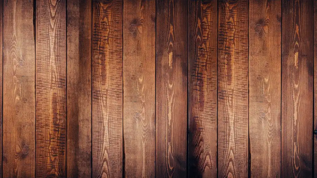
Choose the floor as the lead unless trim or built-ins clearly dominate, then keep the next biggest wood either lighter or darker with a compatible undertone. Most clashes come from equal-value woods with different color casts, or from warm woods that stack orange on orange until the room feels muddy.
Oak or white oak floors with painted trim
Neutral or lightly warm oak floors handle painted trim well. Warm white paint softens yellow and honey notes. Bright white trim can create a cleaner frame when the floor has stronger grain or a deeper brown cast. Furniture should not hover in the same exact depth as the floor unless it is intentionally repeated elsewhere.
In a 1990s house I helped update, the owners kept the white oak floor, repainted the trim from cream to a cleaner warm white, and replaced a similar-tone oak dining set with walnut. The floor looked more current immediately, even though the flooring never changed.
Dark floors with lighter furniture
This is often the safest route. Dark floors already carry a lot of the room visually. Lighter furniture in white oak, lightly smoked oak, or warm neutral woods relieves the weight. Chairs, dining tables, coffee tables, and bed frames should read clearly above the floor, not disappear into it.
Before-and-after, this is one of the clearest transformations. Before: espresso floor, espresso coffee table, espresso TV stand. Everything blended into one low dark band. After: same floor, pale oak table and console, black accents kept small. The room felt bigger without changing a single wall.
Medium warm floors with wood furniture and built-ins
Medium warm floors need discipline. Built-ins should either match closely enough to look intentional or move distinctly darker. A nearby table in another medium stain is where rooms go wrong. If the floor is honey or orange-brown, choose furniture with either a calmer brown base or a darker walnut note.
This is where many homeowners get trapped by “safe” choices. Medium warm plus medium warm plus medium warm is rarely safe. It is just crowded.
Gray-stained floors with trim and furniture that still read natural
Keep gray floors on a short leash. Bright white trim usually works better than creamy trim because it sharpens the cool base instead of turning it greenish or dingy. Furniture should either go dark and clean, such as walnut or near-blackened oak, or stay sparse and let upholstery carry more of the room.
If you want “natural” with a gray floor, lean on texture more than on adding more wood stains. Linen, wool, leather, matte black, and off-white paint usually do more for the room than a third competing wood tone.
What wood tones work best with white trim and painted walls?
White trim works best when the white supports the wood undertone instead of exposing it in a bad way. Warm white paint can suit warm woods with yellow, honey, or soft brown casts. Bright white is stronger beside dark floors, walnut furniture, and cool or neutral woods that need a crisp edge.
Warm white paint with warm woods
Warm white removes some of the stark jump between trim and honey oak, golden oak, or red-brown floors. It gives windows and doors edge definition without making warm floors look more orange. In transitional rooms, this pairing usually feels easier on the eye than icy white. That lines up with paint-brand guidance that warmer whites generally sit better with warm fixed finishes.
Bright white trim as a crisp frame for darker woods
Bright white trim can act like a visual spacer. It separates dark floors from wall color and keeps heavy woods from swallowing openings. It also works with stronger wall colors. Deep navy with bright white trim creates confident contrast. Beside walnut or dark stained flooring, that pairing gives clean structure.
When white paint makes a wood undertone look worse
Very cool bright white can push a mildly warm floor into obvious orange. Creamy white can make cool gray flooring look dirty. If the white seems innocent on the paint chip but the wood shifts after sunset, the pairing is off. Check the trim sample against the floor in both daylight and lamplight.
Can I mix different wood tones in an open-concept room?
Yes, but the connected spaces need one repeating anchor and one clear hierarchy. Keep one undertone family moving through the main view, then shift value or wood amount from zone to zone. Open plans fail when adjacent woods are too similar in darkness yet different in undertone, making every transition look accidental.
Keep one undertone family moving through connected spaces
If the main floor is neutral white oak, repeat that neutrality in at least one major piece per sightline. A dining table, island stools, or media console can carry the same family. If the floor is warm, let the warm family continue even when furniture gets darker.
In open-plan rooms, repeated visual elements are a standard way to create continuity. Here, that repeated element is not identical stain everywhere. It is undertone family plus one anchor finish you can spot from more than one zone.
Where to repeat a wood tone and where to let it change
Repeat the dominant wood in large visual breaks: dining area to living area, kitchen to family room, hall to adjacent bedroom. Change tone more freely in smaller pieces such as side tables or chairs, where contrast reads as editing rather than conflict.
A real example: neutral floor through kitchen, dining, and living room; walnut dining table; walnut media console; lighter oak occasional tables. From photo to photo, the rooms read connected because the walnut repeats and the trim stays consistent, even though not every wood matches.
How to stop adjacent rooms from feeling chopped up
Use consistent trim color across the connected spaces. Painted trim is the easiest bridge. If two rooms have different furniture woods, keep the contrast strategy consistent. For example, both rooms can use pale floors and one darker walnut note, even if the actual furniture pieces differ.
That is the closest thing to a reliable open-plan rule: repeat the bridge, not every piece.
Room-by-room pairing rules by style and contrast level
Transitional rooms: moderate contrast and calm undertones
Transitional spaces usually look best with moderate contrast. Neutral or lightly warm floors, warm white walls, painted trim, and a darker table or case piece keep the room settled. White oak is a strong base here because it does not force the room too rustic or too sleek.
Modern farmhouse: painted trim, warmer floors, simpler furniture pairings
Modern farmhouse often leans on painted trim and walls, with warm flooring underneath. Keep furniture simpler than the floor if the floor has active grain. One darker accent wood is enough. Too many distressed, weathered, or faux-gray woods can make the room feel staged instead of lived in.
Mid-century modern: stronger walnut contrast and cleaner wood edits
Mid-century rooms can carry more contrast. Walnut is often the better answer than trying to find a medium brown that almost matches the floor. Cleaner lines, fewer competing wood stains, and brighter trim keep the contrast sharp instead of busy.
Selecting the Right Pattern for Compact Spaces
Pattern choice dramatically impacts how small rooms feel, often determining whether the space feels open or cramped. While wide planks and classic straight lays create a cleaner, extended visual line suitable for narrow areas, herringbone and chevron patterns add energy to boxy rooms by introducing movement without excessive material waste. The selection process relies on evaluating room shape, primary light sources, and budget constraints to align the layout with the architectural footprint. This ensures the floor enhances the room’s proportions rather than chopping them up with busy geometry that competes for visual space.
For a detailed breakdown of which specific layouts—such as parquet for entryways or wide planks for studies—deliver the best visual results, review our guide to the best wood flooring patterns tailored to compact interiors.
A sampling workflow that catches mistakes before purchase
Compare samples flat and upright in the actual room
- Gather floor, trim, cabinet, and furniture samples together before buying the largest piece.
- Place the floor sample flat where the actual floor will sit.
- Stand trim and furniture samples upright against the wall or next to the floor sample.
- Add the actual wall paint card or painted poster board beside them.
- Remove any sample that looks pinker, grayer, or more orange once grouped.
This is the exact workflow because it catches the most expensive mistakes early. The bad pairings are usually obvious within a minute when all the real materials touch.
Check morning light, afternoon light, and lamplight
Do not choose from one lighting moment. Early daylight often makes cool stains look cleaner than they will later. Low afternoon sun brings yellow and orange to the front, and lamplight is where red undertones usually show themselves. A sample that survives all three checks is far safer than one chosen under store lighting.
Judge sheen, grain, and edge transitions before final choice
Finish sheen can change a wood tone as much as stain depth. Satin often reads softer than semi-gloss. Busy grain next to busy grain creates noise even when color is right. Also look at transitions around windows, doors, baseboards, stair parts, and built-ins. These edges are where undertone mistakes show first.
My favorite “before/after photo” lesson from past projects is always the doorway shot. In the room center, almost anything can look acceptable. At the doorway, where floor, trim, and furniture all meet, the wrong undertone is impossible to ignore.
Frequently asked questions
Should wood furniture match wood floors exactly?
No. Exact matching is optional, and near-matching often looks worse than clear difference. Furniture usually reads better when it shares the floor’s undertone family but shifts lighter or darker enough to separate. Exact matches work best when pieces are large, intentional repeats rather than random one-off items.
Which wood tones should I avoid mixing in the same room?
Avoid woods with similar darkness but conflicting undertones, such as gray-brown beside red-brown, or orange oak beside red cherry. Also avoid piling warm woods on warm woods without value contrast. That is how rooms turn heavy, pink, or overly orange instead of settled and natural.
How many wood tones is too many in one room?
For most rooms, more than 2-3 wood finishes starts to feel scattered unless one is very minor. Use one dominant floor tone, one secondary furniture tone, and an optional accent. Small décor pieces can repeat either major tone instead of introducing another unrelated stain.
How do undertones affect matching floors, trim, and furniture?
Undertones control whether woods feel related or at odds. Floors, trim, and furniture can differ in species, grain, and darkness, but if the undertones are aligned or intentionally balanced, the room settles down. If undertones clash, even expensive pieces can look accidental once they share the same light.
What wood tones work best with white trim and painted walls?
Neutral woods and walnut are usually the easiest with white trim. Warm white paint supports honey, yellow, and soft brown floors. Bright white trim works especially well with dark woods and cooler or neutral floors because it gives crisp separation around doors, windows, and baseboards.
Can I mix different wood tones in an open-concept room?
Yes, if one anchor wood repeats through the main sightlines and the trim stays consistent. Connected rooms need a shared undertone family more than identical pieces. Open plans usually fail when every zone introduces another medium wood that is close in value but different in color cast.
Sources
- USDA Forest Service, Forest Products Laboratory. Wood Handbook: Wood as an Engineering Material. Used here for general material behavior, species variation, and finish context.
- National Wood Flooring Association (NWFA). Technical and consumer guidance on evaluating wood flooring color, finish, and appearance in the installation environment.
- Benjamin Moore. Color and undertone guidance on sampling paint in natural and artificial light and assessing warm versus cool whites next to fixed finishes.
- Sherwin-Williams. Guidance on undertones, lighting, and sampling paint colors in the actual room before final selection.
- NKBA design guidance and standard interior design continuity principles for visual flow in connected/open-plan spaces.
Author experience: I write about finish selection from hands-on home renovation experience, including rooms with existing honey oak, white oak, walnut furniture, red-brown trim, and gray-stained floors. The examples above come from real sample boards, in-room comparisons, and before/after redesigns where the fix was usually not “buy matching wood,” but “correct the undertone and value relationship first.”
Sponsored / affiliate links. As an Amazon Associate I earn from qualifying purchases. I may earn additional commission from eligible campaigns.