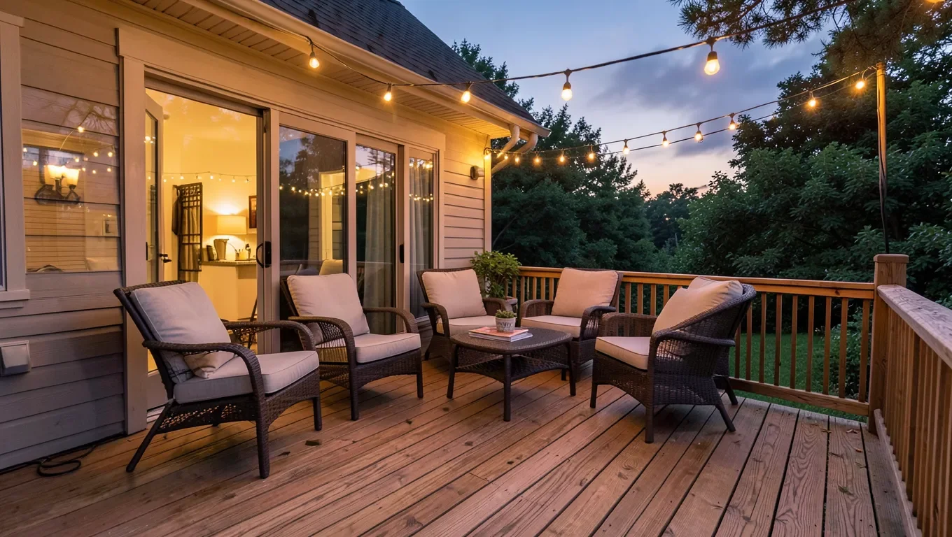
Decking Background: The Real Choices That Shape How Your Deck Looks
What actually makes a deck a good visual backdrop — for gatherings, photos, or just enjoying the space — comes down to a handful of real, controllable choices: board direction and pattern, color and finish, railing style, and lighting. These matter more to how the space actually looks and photographs than the specific wood species alone.
Lighting Changes the Backdrop More Than Almost Anything Else
Lighting Changes the Backdrop Most
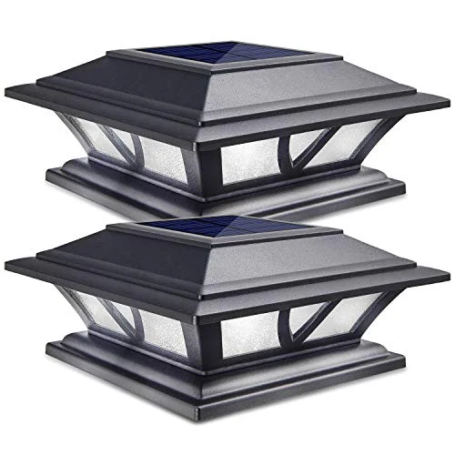 |
Solar Post Cap Lights, 2-Pack – $19.99 Evening lighting does more to change how a deck reads as a backdrop than almost any material choice.
|
The same deck looks completely different at midday, golden hour, and after dark with proper lighting — string lights, post cap lights, or recessed step lighting genuinely transform how the space reads as a background for evening gatherings or photos. This is often the single highest-impact, lowest-cost change for a deck’s overall visual appeal, more so than a stain color change or furniture swap.
Board Direction and Pattern Are Real Design Choices
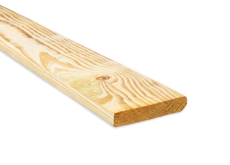
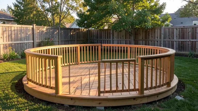
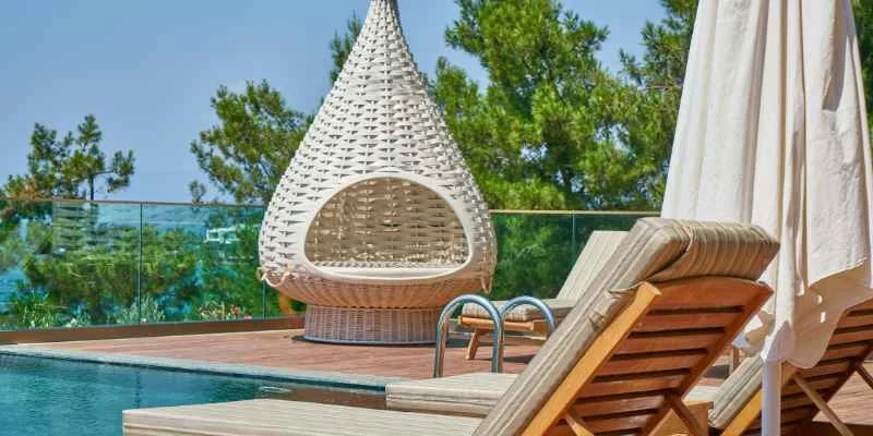
Standard parallel board runs are the default, but diagonal, herringbone, or picture-frame border patterns create a genuinely different visual rhythm in the deck surface itself — a real design choice, not just a construction detail, and one that affects material waste and installation complexity (diagonal and herringbone patterns use noticeably more material due to angled cuts). Board direction should also follow the joist direction structurally, so this is a decision made early in planning, not something changed after the frame is built.
Color and Railing Style Set the Overall Tone
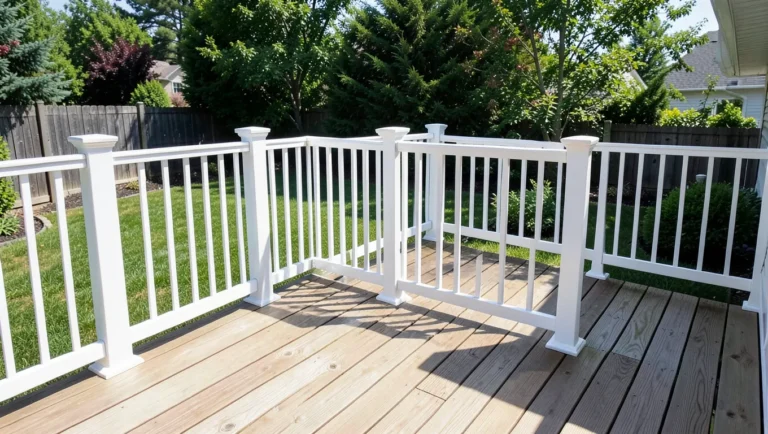
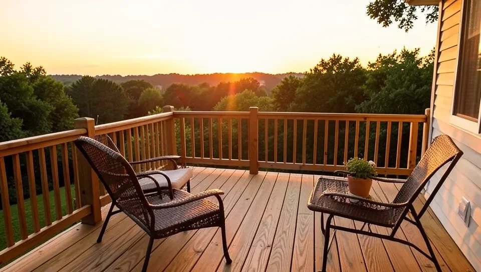
A natural wood tone, gray weathered look, or solid opaque stain color each create a completely different backdrop character — lighter tones generally photograph brighter and feel more open, while darker or natural tones read as warmer and more traditional. Railing style (horizontal cable rail vs. traditional vertical balusters vs. glass panels) changes how much the view beyond the deck stays visible as part of that backdrop, which matters if the deck overlooks something worth keeping visually open.
Frequently Asked Questions
What has the biggest visual impact on a deck’s appearance?
Lighting, generally. Evening lighting changes how a deck reads as a backdrop more dramatically and affordably than most material or color changes.
Does board direction matter for a deck’s look?
Yes. Diagonal, herringbone, or picture-frame patterns create a genuinely different visual rhythm than standard parallel boards, though they use more material and need to be planned with the joist direction from the start.
Should I choose a lighter or darker deck color?
Depends on the effect you want. Lighter tones photograph brighter and feel more open; darker or natural tones read as warmer and more traditional. Neither is objectively better.
Conclusion
A deck’s real visual character comes from lighting, board pattern, color, and railing style working together — genuine, controllable design choices, not just picking a wood species. Lighting is the highest-impact, most affordable place to start if the goal is a better-looking backdrop for how the space is actually used.
Sponsored / affiliate links. As an Amazon Associate I earn from qualifying purchases. I may earn additional commission from eligible campaigns.