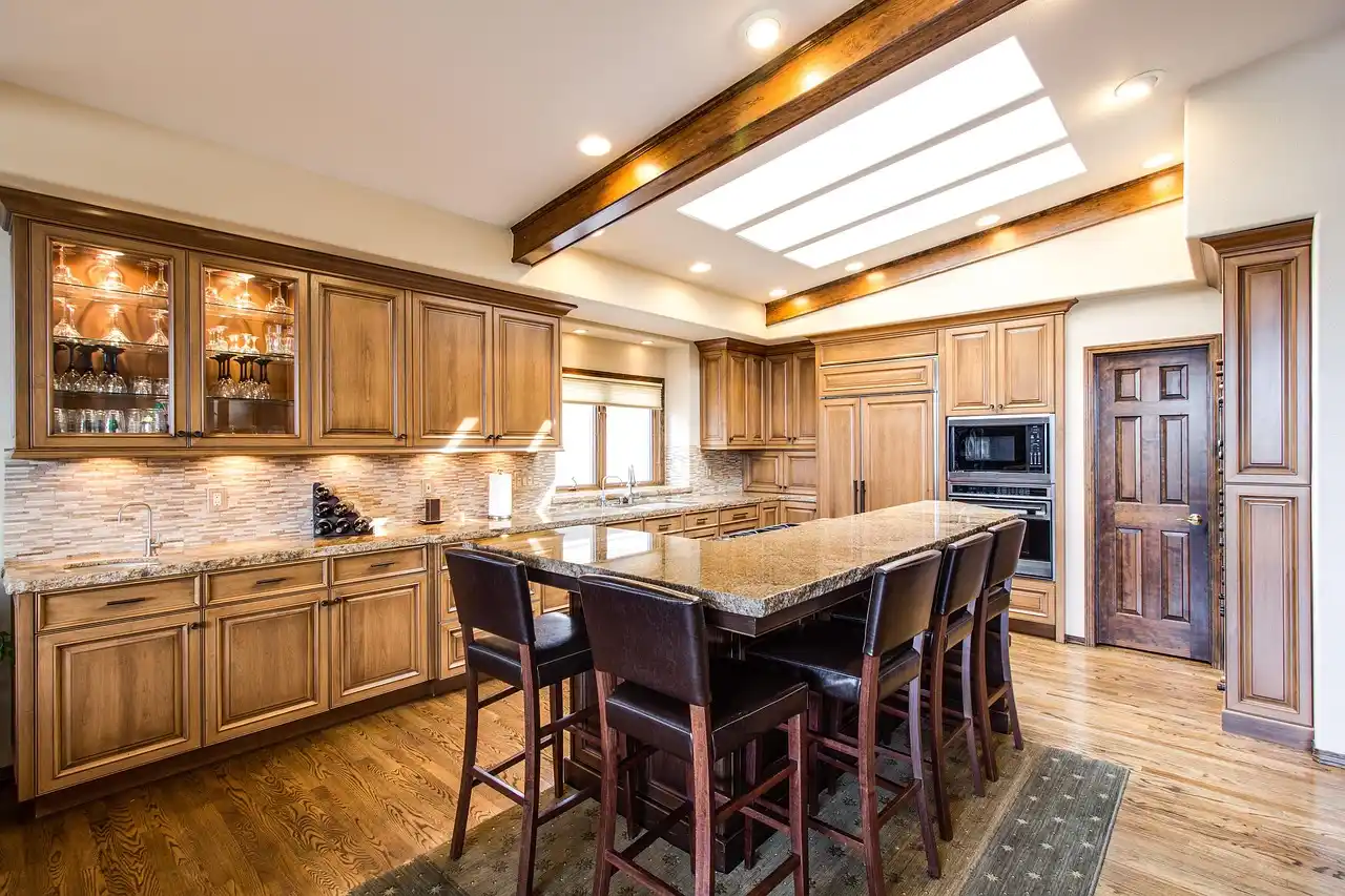
How To Mix Wood Tones In The Same Room Without Clashing
Mix wood tones by choosing one anchor wood for the largest surface, one bridge wood that shares its undertone, and one or two accent woods; keep undertones aligned and repeat each tone twice. Skip that structure and a room reads mismatched, making floors, trim, and furniture look like leftovers instead of intentional choices. This guide gives you a simple decision process for fixed floors, rentals, and open-plan rooms, with clear ways to pair, space, and balance mixed finishes.
Before you buy anything, it also helps to review a few adjacent decisions together: how floors and cabinets relate, how undertones read, and how the rest of the room color palette affects the woods. If you need those companion guides, start with wood floors, then compare our wood undertones guide, room color balancing guide, and floor and cabinet combinations by species.
What you’ll need
- Painter’s tape or sticky notes for tagging each wood finish in the room
- Phone camera
- Daylight bulb and the room’s usual lamp light
- Plain white sheet or white poster board for undertone comparison
- Sample boards, stain swatches, or removable peel samples
- The room-audit worksheet and scoring table below
- A rug, throw, stone tray, glass object, or black metal item to test non-wood breaks
Room-audit method
- Tag every wood finish. Label floor, trim, table, casegoods, frames, shelves, and lamp bases before making any buying decision.
- Choose the anchor first. Start with the biggest wood surface you are least likely to change.
- Classify undertones. Sort each finish as warm, cool, or neutral under daylight and lamp light.
- Assign roles. Limit the room to base tone, secondary tone, and accent tone in no more than three distinct wood tones.
- Check for clashes. Test sheen, tone distance, and repetition before adding one more wood piece.

Step 1: find the anchor wood first
Choose the least changeable wood element
The anchor wood is the largest wood element in the room that you are least likely to replace, refinish, or move. In most homes that means the floor, because changing flooring is far more work than swapping a side table. I start there unless another wood surface clearly runs the room.
In a dining room with a massive fixed table, the table can lead. In a family room with built-ins running wall to wall, those built-ins may carry more visual weight than the floor. In a rental, the floor and trim usually win by default because they are fixed conditions.
When the floor should lead and when furniture should lead
Let the floor lead when it covers most of the visible plane and stays exposed around rugs. Let furniture lead when one large piece dominates eye level, such as a wall unit, a long credenza, or a slab dining table that sits in clear view from several angles.
Open plans need one extra check. Stand at each entry and mark the wood element that reads first from that sight line. If the kitchen floor flows into the dining area, the continuous flooring usually becomes the anchor even if the dining table is darker and more dramatic.
Handle built-ins, trim, and open-plan sight lines
Trim rarely needs to become a counted wood tone if it is painted. Stained trim does count, especially when doors, window casings, and baseboards occupy a lot of wall length. In small rooms, trim can quietly become a second tone without anyone noticing until another almost-matching brown enters the room and starts a fight.
For open plans, keep one anchor across connected zones, then let the secondary and accent shift lightly by area. That stops the chain reaction where the living room answers the dining table, the dining table answers kitchen stools, and every zone adds one more unrelated stain.
What undertones should I look for when matching wood finishes?
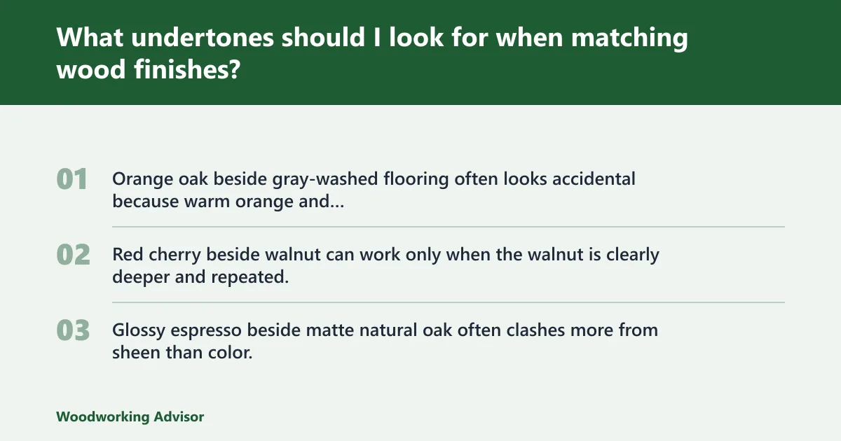
Start with undertones, because undertone matching matters more than simple light-versus-dark matching. Warm wood undertones include golden, honey, red, and orange; cool undertones include gray, ash, weathered, and slightly green; neutral woods are balanced and not strongly warm or cool.
Read undertones instead of surface depth
The goal is not perfect matching. Two woods can differ a lot in darkness and still work if their undertones agree. A honey oak floor and a medium walnut table usually live together well because both sit on the warm side, even though one is lighter. That aligns with how finish and species color are evaluated by woodworking references such as The Wood Database and by stain manufacturers that advise comparing wood species and base color before stain depth.
Problems start when people compare only light, medium, or dark labels. A light gray-washed floor and a light orange oak chair may both read as pale wood, yet their undertones pull in opposite directions. That mismatch stands out more than a stronger contrast would. In my own sample tests, this is the point where homeowners usually say, “The pieces are the same color, so why do they still fight?” The answer is almost always undertone, not value.
Use real-room lighting for the check
Check undertones in a few different lighting conditions, such as morning light, evening light, and the lamp light you use most often in the room. Warm bulbs can push neutral maple toward yellow. North light can make a balanced oak read cooler. Evening lamp light often exaggerates red in cherry and orange in older oak. Paint and design brands repeatedly warn that lighting changes color perception, including guidance from Benjamin Moore and Sherwin-Williams.
Place a white sheet behind the sample or furniture edge. The white field strips away wall color and upholstery influence. Take one photo in daylight and one at night with room lamps on. If the wood flips from warm to cool across those photos, treat it as neutral only if that shift stays mild. If the shift is strong, assume it will be hard to place. A client’s maple console often looks soft beige at noon but appears noticeably yellow by 8 p.m.
Use a quick photo-and-sample test
Rotate the candidate as needed during the sample test. Place each candidate sample beside it, then rotate the candidate ninety degrees. End grain, cathedral grain, and sheen can distort first impressions, and rotation helps isolate undertone. Next, convert the phone photo to low saturation. If two samples still separate clearly, the issue is usually undertone or sheen, not grain drama.
Three common failure cases deserve special care:
- Orange oak beside gray-washed flooring often looks accidental because warm orange and cool gray fight before furniture even enters.
- Red cherry beside walnut can work only when the walnut is clearly deeper and repeated, otherwise the red cast of cherry makes the walnut look muddy.
- Glossy espresso beside matte natural oak often clashes more from sheen than color.
One real-home pairing that worked well for me: a 1990s honey-oak floor, a matte walnut media console, and black steel shelving. Another that needed editing: red cherry picture frames in a room with pale white oak flooring and a smoked-ash coffee table. The frames were small, but they pulled the whole room warmer and glossier than the larger pieces.
How many wood finishes can you use in one room?
Use no more than three distinct wood tones in most rooms. Set the room up as base tone, secondary tone, and accent tone, then repeat each wood tone at least twice so one isolated finish does not read like a mistake.
Use the rule of three wood tones
Most rooms calm down fast when every wood piece gets a role. The base tone is the anchor, usually the floor or built-ins. The secondary tone belongs to the largest movable furniture. The accent tone should stay small: a chair frame, shelf, tray, picture frame, or lamp base.
I treat three as a working limit because each added stain gives the eye one more relationship to sort out. Past three, most homeowners stop seeing a palette and start seeing inventory.
Spot woods that are too close but not matching
The toughest clash is often two woods that almost match. If both sit in the same depth range but one leans red and the other leans yellow, the room feels off in a hard-to-name way. Clear contrast usually looks cleaner.
Use this test: if a piece is close enough that someone would assume it was trying to match the floor, make it either much darker, much lighter, or move it into a painted, black-stained, or metal role. Near misses create more tension than honest contrast.
Know when a fourth finish can stay
A fourth finish can sometimes work when it reads more like black, paint, or near-black than wood. Black-stained oak, dark smoked ash, and ebonized pieces can act as visual punctuation instead of a full new wood family. The same goes for cane-front cabinets with painted frames or a heavily upholstered bench where very little wood shows.
How do I mix warm and cool wood tones?
Mix warm and cool wood tones by letting one side lead, then adding a bridge piece that shares something with both sides, usually texture, grain movement, or a softened neutral undertone. Reclaimed wood or live-edge pieces often help, and black metal, stone, glass, or upholstery can steady the shift.
Pick a bridge piece on purpose
A bridge piece is useful when the room already has both warm and cool woods that cannot leave. Reclaimed wood works because age, weathering, and uneven color often place it between strict warm and strict cool. Live-edge pieces can do the same when the slab carries warm brown in the field and gray in the edges or checks.
Bridge pieces work best when they are medium in value and moderate in sheen. A heavily glossy bridge usually fails because the shine becomes the new issue. That tracks with finish guidance from Fine Woodworking, which notes that finish selection changes both appearance and reflectivity, not just protection.
Use non-wood materials to separate unlike tones
When the room already has a lot of wood, add a non-wood break before adding another finish. Black metal, stone, glass, upholstery, charcoal, and black accents steady a mixed-wood room without adding one more stain to explain.
A useful layout rule is this: if two unlike woods touch, put a buffer between them on the next surface. Examples include a rug between floor and table legs, an upholstered seat between wood frame and wood floor, or a stone tray on top of a wood coffee table before adding a different wood bowl.
Use pairings that fit the floor
Warm floor formulas pair oak, hickory, or honey tones with darker furniture and black details. With warm wood floors, medium walnut or deeper brown furniture usually sits more comfortably than another yellow-orange wood at nearly the same depth. Black-stained or black metal accents help ground the room.
Cool floor formulas pair gray-leaning floors with natural oak or light maple tones. On cool wood floors, neutral woods such as natural oak or light maple keep the room from tipping cold, and charcoal or black accents keep the scheme balanced.
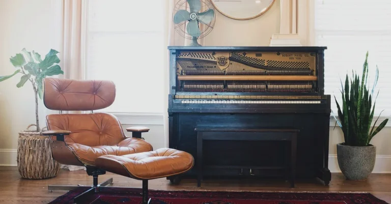
For oak, walnut, and black accents, keep roles clear. Let oak be the base if it is the floor, walnut be the secondary on larger furniture, and black appear as the accent through legs, frames, stools, shelving brackets, or lighting. That keeps black from reading as a fourth wood tone.
Repeat each tone at least twice
Repeating each wood tone at least twice makes the mix feel planned. If walnut appears once on a media console, echo it with a frame, tray, shelf, side table, or lamp base. If black enters through dining chair legs, repeat it in hardware or a floor lamp.
This matters most in small rooms, where a one-off finish draws attention fast. In open plans, repeat by zone: one walnut note in the dining area and one in the living area often ties the space better than stacking all repeats in a single corner.
Step 5: use the room-audit worksheet and clash checklist
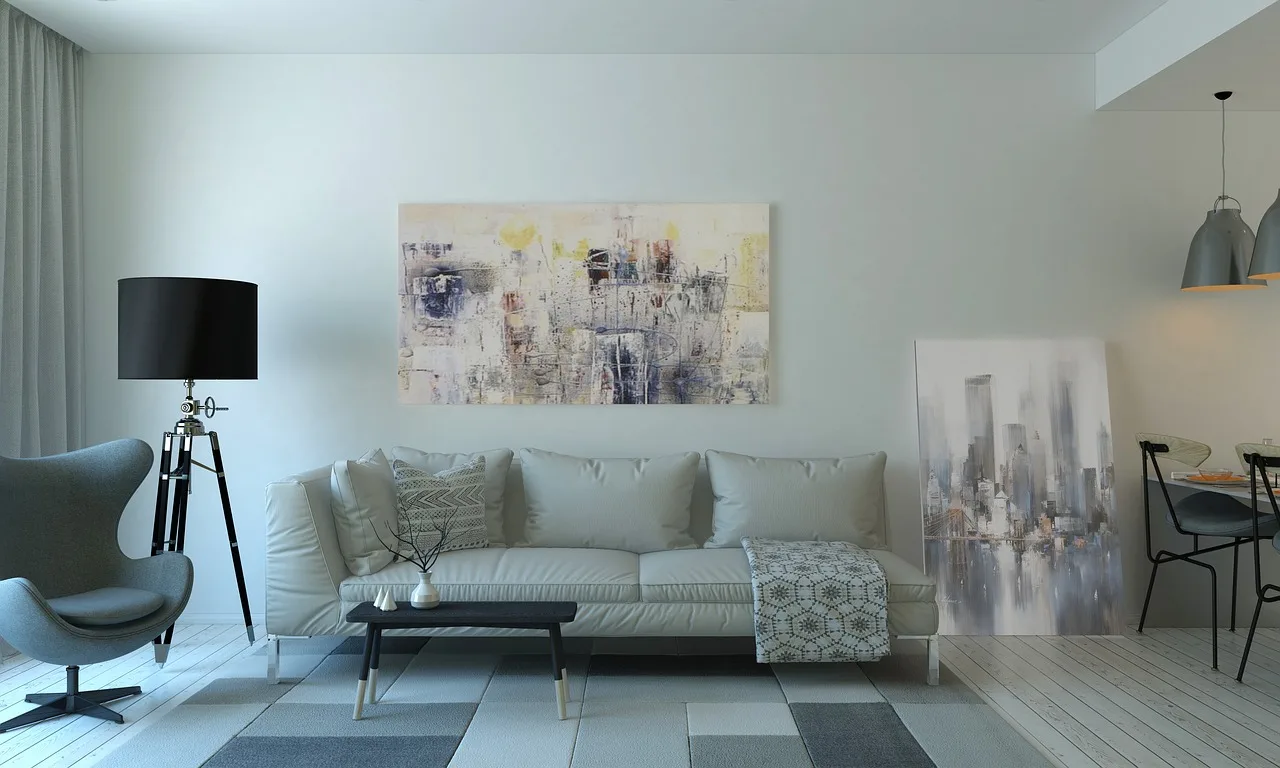
Score the room in three passes
The worksheet below turns broad advice into a room decision. First identify the anchor. Next classify undertones. Last assign each finish to base, secondary, or accent. Use this as a planning tool; the scores are a practical way to rank what should stay, move, or change.
Download the room-audit worksheet for a printable copy with a blank scoring table and an annotated example.
| Wood element | Size/fixity score | Undertone | Role | Sheen family | Repeat count | Action |
|---|---|---|---|---|---|---|
| White oak floor | 3 = large and fixed | Warm honey | Base tone | Matte | Room-wide | Anchor |
| Walnut dining table | 2 = large and movable | Warm brown | Secondary tone | Satin | 1 | Add one walnut repeat |
| Black metal stools | 2 = visible but non-wood | Neutral visual break | Accent support | Matte | 2 | Keep |
| Gray-washed side table | 1 = small and movable | Cool gray | Accent tone | Matte | 1 | Only keep with bridge piece |
| Cherry frame | 1 = small and movable | Warm red | Unassigned | Glossy | 1 | Remove or repaint frame |
Run the clash checklist
- Anchor check: Circle the item with the highest size/fixity score. If two items tie, choose the one seen first from the doorway.
- Undertone check: Mark each finish warm, cool, or neutral using daylight and lamp-light photos against a white background.
- Role check: Assign every wood finish to base, secondary, or accent. If a finish fits none, it is the first candidate to leave.
- Sheen check: Keep finishes in the same sheen family where possible. Mostly matte to satin finishes in the same room usually make mixing easier.
- Mismatch check: A very glossy finish next to a matte finish can sharpen the mismatch, even when undertones align.
- Tone-distance check: If two woods are close in depth but different in undertone, separate them or replace one with a clearer contrast.
- Repetition check: Repeat each wood tone at least twice with frames, trays, shelves, tables, or lamp bases.
Use the worksheet in small rooms, rentals, and open plans
In small rooms, keep the accent tone to a very small area. If the floor and one large furniture tone already dominate, let black, stone, glass, or upholstery carry contrast instead of another wood species.
In rentals, treat flooring and trim as fixed base conditions. Use rugs, upholstered dining chairs, painted side tables, or black metal shelving to break up a stubborn floor without trying to force every wood item to imitate it.
In open plans, make one shared base tone span connected areas, then allow one secondary tone to repeat across zones. Keep accent woods sparse. When the whole main level already has heavy wood, aim for at least one non-wood visual break on each major surface group: floor, seating zone, dining zone, and storage zone.
Annotated example: how I would score a real room
In an open-plan remodel, the room might feature white oak flooring, a satin walnut dining table, matte black counter stools, and one gray-washed side table near the sofa. The floor scored highest for size and fixity, so it became the anchor. The walnut table made sense as the secondary because its warmth related to the floor but its darker depth created a clean contrast. The gray-washed side table was the outlier: cool undertone, single repeat, and no bridge piece nearby. On the worksheet, that meant “keep only with bridge piece” or edit it out.
| Pass | What I marked | Why it mattered | Result |
|---|---|---|---|
| 1. Anchor | White oak floor | Largest fixed wood surface seen from every entry | Base tone set |
| 2. Undertones | Floor = warm honey, table = warm brown, side table = cool gray | The side table was the only cool wood in a mostly warm room | Potential clash flagged |
| 3. Roles and repeats | Walnut repeated once more with a frame; black repeated in lighting | Repeats made the palette look planned, not random | Room felt balanced after one edit |
Common mistakes
Matching surface color while ignoring undertone
A pale wood can still be far too warm for a cool gray floor. Start with undertone, then decide whether the piece should contrast or blend in depth.
Letting several almost-matching woods compete
This is common with builder-grade oak, medium brown casegoods, and one redder vintage piece. If two woods nearly match but do not, keep one and edit the other into paint, black, or a clear contrast.
Mixing matte, satin, and glossy finishes without a plan
Sheen changes color perception. A satin walnut can sit beside matte oak, but a glossy cherry frame can make both look wrong. Keep the room mostly matte to satin when possible. Finish makers and woodworking publications also note that sheen changes reflectivity and highlights surface differences, including guidance from Minwax and Fine Woodworking.
Leaving one wood tone unrepeated
A lone finish looks accidental. Repeat each tone at least twice or remove it from the count by repainting, refinishing, or replacing it with metal, stone, glass, or upholstery.
If that didn’t work, try this next

Start with the easiest edit
- Remove the smallest wood piece that does not fit any role on the worksheet.
- Add one repeat for the strongest movable tone, such as a tray or frame in the same finish.
- Insert a non-wood buffer where unlike woods touch, such as a rug under a table or a stone lamp on a wood console.
Move to moderate changes
- Swap glossy accessories for matte or satin pieces in a similar undertone family.
- Paint or black-stain the item that is too close to the anchor without truly matching it.
- Replace one red-leaning or orange-leaning piece with a neutral wood if the floor is cool.
Use bigger corrections only when needed
- Refinish the most dominant movable furniture so it becomes the secondary tone cleanly.
- Add a bridge piece, such as reclaimed wood or a live-edge table, only after the extra one-off finishes are gone.
- In open plans, simplify one entire zone first rather than changing a little bit in every zone.
Prevention
Before buying any wood furniture, photograph the room’s anchor wood in daylight, bring that photo plus a real sample, and score the new piece on undertone, sheen family, and repeat count before it crosses the threshold. I still do this for my own projects because a store’s overhead lighting can hide the exact yellow, red, or gray cast that becomes obvious at home.
Frequently asked questions
How do I mix wood tones in the same room without making it look messy?
Choose one anchor wood, assign one secondary wood, and keep any third finish small. Match undertones before matching darkness, keep sheens close, and repeat each wood tone at least twice. If a piece does not fit base, secondary, or accent, remove it or convert it to a painted or black role.
Should wood tones match the floor or the furniture?
Usually they should answer the floor, because the floor is often the largest and least changeable element. If one table, wall unit, or run of built-ins dominates more than the floor visually, that piece can lead instead. The goal is not perfect matching, but a clear hierarchy.
How do I mix warm and cool wood tones?
Let one side lead, then connect the two with a bridge piece or a neutral break. Reclaimed wood, live-edge pieces, black metal, stone, glass, and upholstery help. If the floor is warm, use warmer secondary furniture; if the floor is cool, bring in neutral woods such as natural oak or light maple.
Do wood sheens matter when mixing finishes?
Yes. A very glossy finish next to a matte finish can sharpen the mismatch and make two otherwise compatible woods look unrelated. Mostly matte to satin finishes in the same room usually make mixing easier, especially when the woods are already different in depth or grain pattern.
How can I tell if two wood tones are too close but not matching?
Set the samples side by side against a white background in daylight and lamp light. If they are similar in darkness but one reads redder, yellower, grayer, or greener, they are too close. Push one lighter, darker, blacker, or fully painted instead of forcing an almost-match.
What should I do if my room already has too many wood finishes?
Audit every wood item, pick the anchor, and cut the palette back to base, secondary, and accent. Start by removing or repainting the smallest one-off pieces, then add non-wood breaks where unlike woods touch. Only after editing should any bridge piece or refinishing plan be considered.
Sources
- Benjamin Moore: How Light Affects Color
- Sherwin-Williams: How Lighting Affects Paint Colors
- Fine Woodworking: Choosing a Finish
- Minwax: Understanding Wood Finishes
- The Wood Database: Wood Finishes 101
Sponsored / affiliate links. As an Amazon Associate I earn from qualifying purchases. I may earn additional commission from eligible campaigns.