What Colors Go Well With Dark Wood Floors (The LRV Rule)
Dark wood floors work best with light, high-LRV colors (Alabaster, White Dove, Swiss Coffee) or genuinely moody tones under LRV 25 — the muddy middle ground washes both out. The wrong pick makes a room look dim instead of dramatic. This guide covers wall paint, furniture, rugs, and accessories, and links you to a full undertone-matching walkthrough if walls are your main decision.
Quick Answer
Soft whites and warm neutrals (LRV 75+, like Alabaster or White Dove) brighten a room with dark wood floors, while navy, forest green, or deep red (LRV under 25) create a bold, cohesive look. Avoid mid-range gray-beige colors (LRV 40-60) — they tend to look muddy against dark floors instead of intentional.
Start Here: Which Color Decision Matters Most in Your Room?
Best Paint-Testing Pick
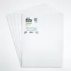
Mighty Board Minis Paint Color Test Panels (Set of 5)
Reusable 12″x9″ panels for testing up to 5 real paint samples side by side against your actual floor and lighting before you commit a whole wall.
- Best for: comparing 2-3 finalist wall colors in the same room, same day
- Why we picked it: moves paint samples around the room to check them against dark floors in different light, instead of relying on a tiny store chip
- Main drawback: you still buy separate sample pots of paint to brush onto the panels
Compare more paint-testing options
 Option 1 FAVOMOTO 365-Color Sample Cards
|
 Option 2 FoamPRO 120 Tester Boards, 24-Pack
|
 Option 3 Klyyo Clyro Test Panels, 5-Pack
|
As an Amazon Associate we earn from qualifying purchases.
“What colors go with dark wood floors” usually means one of four separate decisions — walls, furniture, cabinets, or textiles — and each has its own tradeoffs. Use this table to jump straight to the decision you’re actually facing; the sections below cover the general color theory that applies to all four. If your question is really about caring for or refinishing the floor itself rather than what to put around it, our wood flooring guide covers cleaning, repairs, and refinishing.
| Decision | Fast rule of thumb | Full guide |
|---|---|---|
| Wall paint | Match your floor’s warm or cool undertone first, then pick LRV 75+ for light or LRV 25- for moody | Wall colors for dark wood floors, by undertone |
| Furniture | Light hardwood (maple, white oak, ash) or metal/glass pieces read as intentional, not mismatched | What color furniture goes with dark wood floors |
| Cabinets | White or greige cabinets contrast cleanly; matching wood-on-wood needs 2+ shades of separation | What color cabinets go with dark wood floors |
| Rugs & accessories | Light, warm-toned rugs (cream, oatmeal, faded Persian) break up large expanses of dark flooring fastest | See the Accessorizing section below |
Bright and Airy: Light Hues
Soft whites, creams, light grays, and pastels are the safest way to brighten a room with dark wood floors, because they reflect the most light back into the space. Sherwin-Williams Alabaster, Benjamin Moore White Dove, and Benjamin Moore Swiss Coffee are the three most-recommended options for this — all sit above LRV 80, meaning they bounce back over 80% of the light that hits them.
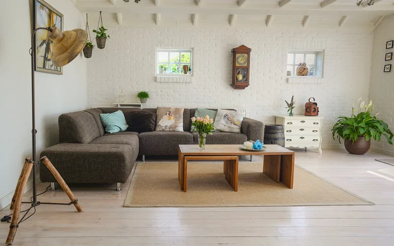
Pastel hues work the same way in smaller doses. Pale blues, sage greens, and soft pinks reflect light like the neutrals above but add a hint of color instead of staying purely neutral — useful in a bedroom or reading nook where a pure white can feel clinical.
| Paint color | Brand / code | LRV | Undertone |
|---|---|---|---|
| White Dove | Benjamin Moore OC-17 | 85.4 | Warm, slightly creamy |
| Swiss Coffee | Benjamin Moore OC-45 | 84 | Warm white |
| Alabaster | Sherwin-Williams SW 7008 | 82 | Warm greige-white |
| Agreeable Gray | Sherwin-Williams SW 7029 | 60 | Warm gray (greige) |
Data point: designers generally recommend committing to either LRV 75+ (light) or LRV 25 and under (moody/saturated) in rooms with dark wood floors — colors in the LRV 40-60 middle band tend to read as an indecisive gray-beige rather than a deliberate choice.
Warm Neutrals: Beige and Taupe
Beige and taupe sit lower on the LRV scale than pure whites but still read as neutral, which is why they work as a warm middle ground between stark white walls and the deep tones of the floor. Beige creates a seamless, gallery-like backdrop; taupe (a gray-brown blend) is the better pick if the room already has a lot of warm wood tones and needs a slightly cooler counterbalance.
Use them consistently — walls, upholstery, and trim in the same warm-neutral family — rather than mixing a warm beige wall with a cool taupe sofa, which is the most common way this palette starts to look accidental instead of intentional.
Cool Contrasts: Blues and Greens
Blues and greens work as a deliberate contrast rather than a brightener. Navy, sky blue, and turquoise create depth against dark flooring; sage, mint, and emerald lean on the natural wood-and-plant pairing. Both hold up better in accents than as an all-over wall color unless the room gets strong natural light.
- Blue accent pillows, throws, or curtains for a low-commitment test run
- Blue or green artwork and wall decor as a focal point
- A blue or green area rug to anchor furniture without repainting
- Potted plants for a green accent that doesn’t require any paint decision at all
Bold Statements: Deep Reds and Vibrant Yellows
Deep reds (burgundy, wine) and vibrant yellows sit at the saturated end of the palette and pair with dark wood floors the same way the sub-LRV-25 neutrals do — by committing rather than splitting the difference. Reds work best as an accent wall, statement furniture piece, or textiles; a full room of deep red against dark floors gets heavy fast without enough light-colored trim to break it up. Yellow is easiest to overuse — one statement piece (a chair, a rug, a piece of art) does more for the room than a full wall.
The Impact of Light Reflectance
Light Reflectance Value (LRV) measures the percentage of light a paint color bounces back into a room, on a scale of 0 (absolute black) to 100 (pure white). It matters more with dark wood floors than with light floors, because the floor is already absorbing a large share of the light hitting it — a low-LRV wall color on top of that can make a room feel noticeably darker than the paint chip suggested in the store.
As a working rule: commit to either LRV 75 or higher (a genuinely bright wall) or LRV 25 or lower (a deliberately moody, saturated wall). The middle band, roughly LRV 40 to 60, is where most “why does this room feel dingy” complaints trace back to — a mid-tone gray-beige that isn’t reflective enough to brighten the room and isn’t dark enough to read as an intentional design choice.
Glossy vs. Matte Floor Finishes
The floor’s own finish changes how much any wall color reads. A glossy or satin finish on dark wood bounces light around the room and can make a mid-LRV wall color look brighter than it would over a matte floor. A matte or hand-scraped finish absorbs more light, which is why rooms with matte dark floors usually need a wall color a shade or two lighter than the same room would with a glossy floor to hit the same brightness.
Textural Elements in Decor
Color isn’t the only variable — texture changes how a color reads against dark wood. Leather and velvet in muted, muddied hues (gray, greige, taupe, sage) add warmth without competing with the floor’s grain. Rugs and woven fabrics with visible texture do the same job at floor level, breaking up a large expanse of dark flooring with tactile contrast instead of only color contrast.
Furniture Pairings With Dark Floors
Furniture color and material matter as much as wall paint. Wood-and-metal pieces (a dark wood dining table with metal-legged chairs) read as intentional contrast rather than mismatched wood tones. Glass and lucite pieces go further — a glass coffee table or lucite side table adds almost no visual weight, so the floor stays the focal point instead of competing with another dark surface. For a full breakdown of light hardwood species, upholstery colors, and specific pairing mistakes, see our dedicated furniture-color guide.
Accessorizing Dark Wood Floors
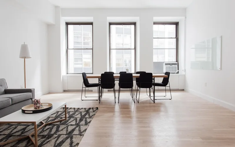
Rugs do the most visual work of any accessory. Light, warm-toned rugs (cream, oatmeal, faded Persian patterns) break up a large expanse of dark flooring and make the room read as brighter and larger; a deep burgundy or navy rug instead leans into the floor’s richness for a more cohesive, formal look. Either direction works — the mistake is a mid-tone rug that neither contrasts nor blends.
For art and metallic accents, match the same LRV logic used for walls: light, neutral frames and mats brighten; gold or aged-brass hardware adds warmth without needing to match the floor’s exact tone.
Common Mistakes to Avoid
- Picking a mid-LRV gray-beige wall color. Colors in the LRV 40-60 range are the most common source of “this room feels dingy” complaints against dark floors — commit to light (75+) or moody (25-) instead.
- Testing paint on a tiny store chip. A 2-inch chip under store lighting looks nothing like a full wall under your room’s actual light — test full-size panels against the floor itself before buying gallons.
- Mixing warm and cool neutrals in the same room. A warm beige wall with cool-gray furniture is the most common way a “neutral” palette starts to look accidental instead of intentional.
- Choosing a mid-tone rug. A rug close in value to the floor disappears visually instead of adding contrast — go noticeably lighter or noticeably darker.
Frequently Asked Questions
How do I brighten a room with dark wood floors?
Use wall colors with an LRV of 75 or higher, such as Alabaster, White Dove, or Swiss Coffee, and pair them with light-colored furniture and a light, warm-toned rug. Glossy floor finishes also bounce more light back into the room than matte finishes.
What color goes best against dark wood floors?
Neutral, high-LRV wall colors such as Alabaster, Swiss Coffee, White Dove, Accessible Beige, Agreeable Gray, and Sea Salt are the most commonly recommended against dark wood. For a bolder look, deep colors under LRV 25 — navy, forest green, or burgundy — work as a deliberate contrast instead.
What color rug goes with dark wood floors?
A light, warm-toned rug in cream, soft gray, or oatmeal creates the strongest contrast and makes the room feel larger. A deep-toned rug in burgundy or navy works if you want the floor and rug to blend into a more formal, cohesive look instead.
What color wood floor goes with everything?
Light wood floors — maple, white oak, ash, or hickory — pair with the widest range of wall colors and furniture styles, since they don’t force the LRV 75-or-25 commitment that dark floors require.
Should wall color match dark wood floors or contrast with them?
Contrast almost always works better. Matching a wall color to the floor’s exact warm or cool undertone (rather than its value) keeps the palette from clashing, but the wall itself should sit at the light or dark end of the LRV scale — not the same mid-tone as the floor.
Do dark wood floors make a room feel smaller?
They can, mainly in rooms with limited natural light, because dark surfaces absorb rather than reflect light. Pairing them with LRV 75+ walls, light furniture, and a light rug counteracts most of that effect without requiring you to change the flooring itself.
Conclusion
The fastest way to get colors right against dark wood floors is to stop treating LRV 40-60 as a safe middle ground — it’s usually the source of a room that feels dingy instead of intentional. Commit to bright (LRV 75+) or moody (LRV 25-) walls, match furniture and rugs to the same logic, and use the wall-color guide, furniture-color guide, or cabinet-color guide above for the specific decision you’re facing.
Sponsored / affiliate links. As an Amazon Associate I earn from qualifying purchases. I may earn additional commission from eligible campaigns.