Backsplash Ideas for Cherry Wood Cabinets That Actually Work
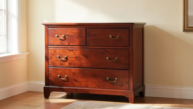
Cherry wood cabinets have a warm, reddish-brown color that gets noticeably richer the longer it’s in your kitchen – freshly installed cherry starts out closer to a soft pink-brown and deepens toward a fuller red-brown over roughly the first six to twelve months of everyday light exposure, then keeps darkening more slowly for years after. That single fact changes how you should think about a backsplash: pick a starkly cool white or gray tile to contrast today’s lighter cherry, and by next year the cabinets may have darkened enough that the contrast looks even sharper than you planned. Not a bad thing, but worth knowing before you order tile.
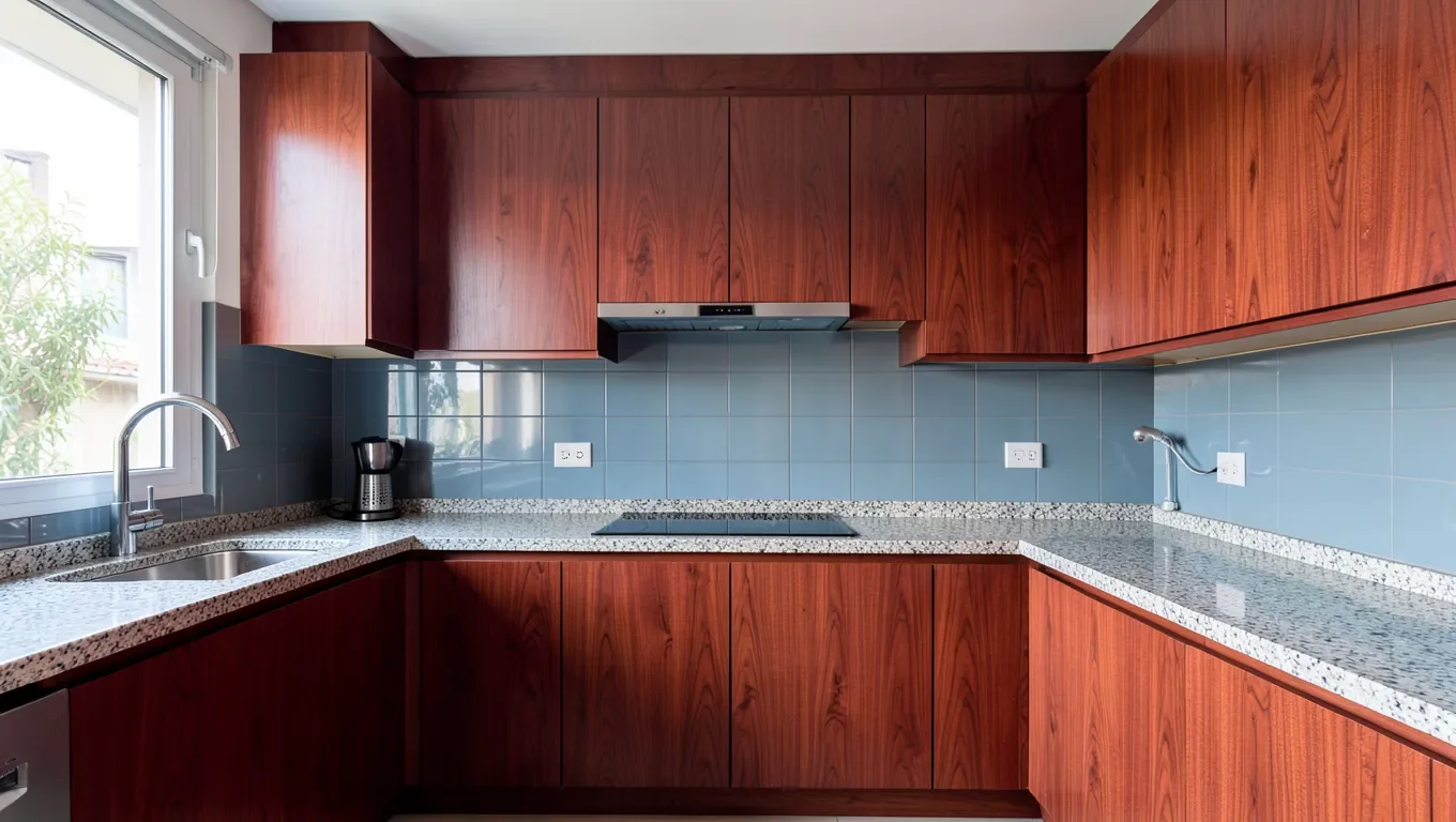
There’s no single “right” backsplash for cherry cabinets, and both directions below are legitimate. Cool-toned choices like white or gray subway tile and blue-gray glass mosaic create real contrast against cherry’s warm red tones. Warm-toned choices like cream, beige, and light travertine blend into a softer, more monochromatic look instead. Which one is right for you depends on whether you want the cabinets to stand out as the room’s focal point or read as part of one continuous warm palette. If your cabinets are a different wood species, our general guide to kitchen backsplash ideas for wood cabinets covers the same contrast-vs-blend decision across other wood tones.
Our Pick to Keep Cherry Cabinets Backsplash-Ready
Best Cherry Cabinet Conditioner
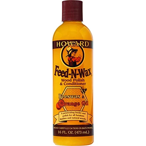 |
Howard Feed-N-Wax Wood Polish & Conditioner, 16 oz – $10.98 Cherry that’s gone dry, dull, or blotchy makes even a well-chosen backsplash look mismatched – this conditions the finish and evens out the color as the wood ages.
|
Whatever direction you choose, the pairing only reads as intentional next to cabinets that are actually maintained. Cherry that’s gone dry, dull, or blotchy from dust buildup and a drying finish undercuts even a well-chosen backsplash – the wood needs to look consistent for the color relationship to work.
Understanding Cherry Wood Cabinet Colors
Cherry is one of the few common cabinet woods that visibly changes color after installation. Fresh-cut cherry heartwood starts out a light pinkish-brown; ordinary room light and any UV exposure trigger a natural oxidation reaction in the wood’s surface that deepens the color over time. A clear or lightly tinted finish doesn’t stop this process – it just protects the wood while the color underneath keeps developing. That’s different from cabinet woods like maple or oak, where the color you see on installation day is close to the color you’ll still have five years later.
For backsplash planning, the practical takeaway is to judge your pairing against where the cabinets are headed, not just where they are the day the tile goes in. A pale pinkish cherry might only mildly contrast with a soft gray tile at first, but once the wood darkens toward a fuller red-brown, that same gray reads as a noticeably stronger contrast. If you’d rather the cabinet-backsplash relationship stay fairly consistent over the years, lean toward tones that will still make sense once the cherry has fully darkened, not just the shade it is on installation day. If you’re considering skipping this decision entirely and painting your cherry cabinets instead, keep in mind that removes the color-shift question altogether, for better or worse.
Variations in Cherry Wood Finishes
Natural or clear-coated cherry shows the wood’s own color shift most dramatically, since there’s no added pigment working against it. Stained cherry, especially with a darker stain, starts closer to its eventual color and shifts less dramatically, though it still ambers somewhat under a standard topcoat. Glazed or antiqued finishes usually mute the color change further because the glaze itself provides a consistent tone over the grain. If you’re not sure which finish your own cabinets have, compare a spot that gets no daylight, inside a cabinet or behind a hinge plate, to an exposed door front. A noticeable difference confirms you have natural or lightly finished cherry that’s still actively darkening.
The Impact of Lighting
Sunlight accelerates cherry’s color change more than indoor lighting does, since it’s the UV component doing most of the work. Cabinets near an uncovered south- or west-facing window will often darken faster, and less evenly, than cabinets in an interior kitchen lit mainly by overhead fixtures. Bulb temperature matters for how the pairing looks day to day, too: warm 2700-3000K bulbs make lighter cherry look warmer than it will under cooler daylight-temperature LEDs. It’s worth holding a tile sample against your cabinets under your kitchen’s actual lighting, not just in daylight from a showroom, before committing to a full order.
Backsplash Materials That Complement Cherry Wood
Once you know which direction, contrast or blend, you’re leaning toward, the material choice mostly comes down to maintenance and how much visual texture you want next to the wood grain.
Natural Stone Options
Travertine and limestone bring warm, earthy tones that blend with cherry’s reddish undertones, while granite and slate can go either warm or cool depending on the specific slab, which makes them useful if you want a natural-material look without fully committing to one direction. Stone needs periodic sealing to resist staining, and the irregular veining reads as more traditional than a uniform tile pattern.
Ceramic and Porcelain Tiles
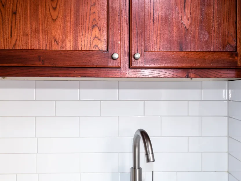
Ceramic and porcelain are the easiest materials to match to a specific plan, since they come in a controlled range of colors and finishes rather than natural variation. Classic white or cream subway tile is the most common cherry pairing for a reason: it’s inexpensive, durable, and works with either a contrast or a blend approach depending on how warm or cool the white leans. Porcelain in particular resists moisture and stains well, which matters near a stove or sink.
Glass Backsplashes
Glass tile reflects more light than stone or ceramic, which can help brighten a kitchen where cherry’s dark tones make the room feel heavier. A blue-gray glass mosaic is one of the more effective cool-contrast options specifically because the glass surface stays visually crisp even as the cabinets darken with age, so the contrast holds up over time better than some painted or stained materials do.
Metal Backsplashes
Stainless steel reads as a cool, neutral contrast and is common behind a range or cooktop for its heat resistance. Copper and brass, on the other hand, are warm metals that tend to blend with cherry’s reddish tones rather than contrast them, so they’re a better fit if you’re leaning toward the monochromatic direction than the high-contrast one.
Color Palettes That Harmonize with Cherry Wood
This is really the same contrast-versus-blend decision from the intro, applied to specific colors rather than materials.
Warm Neutrals
Cream, off-white, soft beige, and warm gray backsplashes create the blended, monochromatic look. They let the cherry’s grain and color stay the visual focus of the room instead of competing with a starkly different backsplash tone.
Earthy Tones
Terracotta, warm greens, and muted golds pick up on cherry’s undertones without matching it directly, which is a middle ground between a full contrast and a full blend. This palette tends to read as more traditional or rustic than a strict neutral scheme.
Contrasting Colors
White, light gray, charcoal, and navy blue are the standard contrast picks, and darker versions like charcoal or navy tend to look more dramatic and formal than a crisp white. Because cherry darkens over time, a contrast pairing chosen when the cabinets are still fairly light will typically look more dramatic, not less, a year or two down the road.
Backsplash Styles for Different Kitchen Aesthetics
Modern and Contemporary
Large-format tile in a single cool tone, handleless cabinet hardware, and a minimal grout pattern all read as modern next to cherry’s traditional warmth, which is part of what makes the pairing feel intentional rather than dated.
Traditional and Classic
Subway tile in a running-bond pattern, natural stone with visible veining, and a warmer grout color all support cherry’s more classic, formal character rather than working against it.
Rustic and Farmhouse
Handmade-look ceramic tile with slight surface variation, brick-pattern tile, or a rougher natural stone finish adds texture that pairs well with cherry in a farmhouse or rustic kitchen, where a perfectly uniform tile can look out of place.
Considering Your Countertop
Your countertop is a third variable alongside the cabinets and backsplash, and it needs to work with both rather than being picked in isolation.
| Countertop Material | Complementary Backsplash with Cherry Cabinets | Style Notes |
|---|---|---|
| White Quartz | Cream subway tile, subtle marble mosaic, light beige travertine | Bright, clean contrast; backsplash can be simple or patterned |
| Dark Granite (Absolute Black, Black Galaxy) | Stainless steel, white glass tile, light natural stone | Dramatic contrast; backsplash balances the dark countertop |
| Butcher Block | Muted subway tile, travertine, brick-look tile | Warm, natural pairing; avoid a competing wood tone |
| Light-Colored Laminate | Warm-toned ceramic mosaic, patterned ceramic tile, solid-color glass | Laminate is visually quiet; backsplash can be the focal point |
| Concrete | Metallic-accent glass mosaic, neutral subway tile, honed limestone | Industrial or modern feel; backsplash can soften or reinforce it |
Installation Considerations
Grout color, tile orientation, and installation pattern all affect how a finished backsplash actually looks next to cherry, beyond just the tile color itself.
- Grout color: Matching grout to the tile creates a seamless, blended look; contrasting grout makes individual tiles pop. Cream or beige grout usually works best with similarly warm-toned tile, while a darker grout adds definition against lighter tile.
- Tile layout: Horizontal and vertical layouts are the safe default, but diagonal, herringbone, or stacked patterns add visual interest, especially with a simple subway-style tile.
- Test before you commit: Because cherry’s color keeps shifting for months after installation, holding a real tile sample against your actual cabinets under your kitchen’s lighting is worth more than judging from a showroom display. A peel-and-stick tile sample or a small test section is a low-cost way to check a pairing before ordering a full run of a more permanent material.
Frequently Asked Questions
Question: What are the best neutral colors for a backsplash with cherry wood cabinets?
Answer: Warm neutrals like cream, soft beige, and warm gray are the safest choice for a blended look, since they let the cherry’s own color and grain stay the visual focus instead of competing with the backsplash.
Question: Can I use a dark backsplash with cherry wood cabinets?
Answer: Yes. Charcoal gray, deep navy, or dark bronze create a dramatic, formal contrast with cherry, and tend to work especially well in a well-lit kitchen where the darker tile won’t make the room feel closed in.
Question: What type of backsplash material is most durable with cherry wood cabinets?
Answer: Porcelain tile and natural granite are both highly durable and easy to maintain. Stainless steel and tempered glass are also strong, low-maintenance options if you want a cooler, more modern surface.
Question: Should the backsplash match my countertop or cabinets?
Answer: It doesn’t need to match either one exactly. The goal is coordination, not an exact match, so the backsplash should work with both the cabinet’s warm cherry tone and the countertop’s color and finish as one cohesive palette.
Question: Are glass backsplashes a good idea with cherry wood cabinets?
Answer: Yes. Glass tile reflects more light than stone or ceramic, which helps offset cherry’s naturally darker tones, and a blue-gray glass mosaic in particular holds up well as a cool contrast even as the cabinets continue to darken with age.
Question: Will my backsplash still look right after my cherry cabinets darken with age?
Answer: In most cases, yes, but the relationship will shift. A cool contrast pairing (white, gray, blue-gray) will typically look more dramatic as the cabinets darken, while a warm blend pairing (cream, beige, travertine) will stay closer to how it looked on day one, since it isn’t relying on a color gap that changes as the wood ages.
Final Thoughts
Choosing a backsplash for cherry wood cabinets comes down to one real decision: contrast the wood’s warmth with something cool, or blend into it with something warm. Both are legitimate, and the material, from classic subway tile to natural stone to glass mosaic, mostly just executes whichever direction you pick. The detail most guides skip is that cherry itself isn’t static; it keeps darkening for months after installation, so it’s worth judging your pairing against where the cabinets are headed, not just how they look on installation day.
Sponsored / affiliate links. As an Amazon Associate I earn from qualifying purchases. I may earn additional commission from eligible campaigns.